| Author | Thread |
Comments Made During the Challenge  |
|
|
05/11/2003 05:00:01 PM |
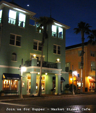
| The difference between the light and dark zones is too great and so you are washing out some parts and darkening others parts.. |
|
 Photographer found comment helpful. Photographer found comment helpful. |
|
|
05/11/2003 11:31:15 AM |
| If cropped differently the upper floor wouldn't show, which is too bright and draws attention from the street level. |
|
| Photographer found comment helpful. |
|
|
05/09/2003 12:18:35 PM |
| :) Maybe a head on shot or a closer view on the angle would give a little more impact to this cafe. Also, it seems quite a bit out of focus. |
|
| Photographer found comment helpful. |
|
|
05/08/2003 07:52:04 PM |
| Could be an interesting subject. Would need to be straighened and focused more sharply for me to take it off the postcard display. |
|
| Photographer found comment helpful. |
|
|
05/08/2003 05:31:17 AM |
| Is that the moon up there in the sky? You chose the right shutter speed for this image, those lights are bright but not blown out at all, good. I would have tried a few different variations on text style though, the one you chose looks a little bland. |
|
| Photographer found comment helpful. |
|
|
05/07/2003 08:04:14 PM |
| good composition but the shot is a little fuzzy and noisey |
|
| Photographer found comment helpful. |
|
|
05/07/2003 11:25:12 AM |
| The composition is juuuuuuust crooked-looking enough to make me feel like I'm the one that's aslant, slightly. Kind of uncomfortable. The lighting feels odd, too. Plus, I can't see it on a postcard, and since that's the theme ... |
|
| Photographer found comment helpful. |
|
|
05/07/2003 07:18:46 AM |
| I don't like the choice of text but the picture itself is nice. For a moment I thought it might be in South Beach (Miami, FL) |
|
| Photographer found comment helpful. |
|
|
05/06/2003 12:03:45 PM |
| Excellent theme - the only trouble is the grainy texture... |
|
| Photographer found comment helpful. |
|
|
05/06/2003 08:46:07 AM |
|
| Photographer found comment helpful. |
Home -
Challenges -
Community -
League -
Photos -
Cameras -
Lenses -
Learn -
Help -
Terms of Use -
Privacy -
Top ^
DPChallenge, and website content and design, Copyright © 2001-2025 Challenging Technologies, LLC.
All digital photo copyrights belong to the photographers and may not be used without permission.
Current Server Time: 04/12/2025 04:42:28 AM EDT.