| Author | Thread |
Comments Made During the Challenge  |
|
|
05/11/2003 04:57:25 PM |
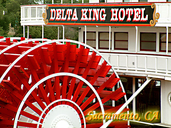
| Some water in the shot would have been great, as it is the red is so powerful it seems to unbalance the shot! 6 |
|
 Photographer found comment helpful. Photographer found comment helpful. |
|
|
05/09/2003 09:42:25 AM |
| The paddle wheel is foremost in this shot, and it looks like a fun place. Nice use of light and composition. |
|
| Photographer found comment helpful. |
|
|
05/08/2003 08:00:31 PM |
| i think a nice white border would be a good finishing touch..perhaps 4 pixels? |
|
| Photographer found comment helpful. |
|
|
05/08/2003 07:17:08 PM |
| I really really like this. Saw the thumbnail awhile ago, and couldn't wait to get to this one. The only proble I see is that the words "Delta King Hotel" kind of bug my eyes out. I'm not sure if it's just the way it is, or if the focus is just a tad soft, but I still love it anyway. Very nice. ~Heather~ |
|
| Photographer found comment helpful. |
|
|
05/08/2003 05:20:35 AM |
| Good postcard shot. I especially like the way the white stands out against that vivid red color on the wheel, very effective. Good idea. |
|
| Photographer found comment helpful. |
|
|
05/07/2003 11:47:04 AM |
| Very nice composition. Good color too. |
|
| Photographer found comment helpful. |
|
|
05/07/2003 11:24:27 AM |
| Cropped a little too tightly for a classic 'postcard' look ... and, pardon me, but it's ugly. IMHO. :-> Nice focus and colors and contrast, though. It's just ... busy, and there's no compositional center. |
|
| Photographer found comment helpful. |
|
|
05/06/2003 12:33:37 PM |
| Yea Sacramento! Nice job. I tried to get a shot of this also but alas,no luck. |
|
| Photographer found comment helpful. |
|
|
05/06/2003 08:37:49 AM |
|
| Photographer found comment helpful. |
|
|
05/06/2003 06:33:48 AM |
| I wouldn't want to be the painter. Colorful shot. |
|
| Photographer found comment helpful. |
|
|
05/05/2003 10:30:10 PM |
| Nice color and great composition but I think the crop is a little too tight. I would like to see more of the boat. 7 |
|
| Photographer found comment helpful. |
|
|
05/05/2003 04:40:22 PM |
|
| Photographer found comment helpful. |
|
|
05/05/2003 01:25:11 PM |
| nice saturation in the red, good composition with the wheel and the sign. |
|
| Photographer found comment helpful. |
|
|
05/05/2003 08:39:31 AM |
| Strange color in the letters, also I don't like the "photoshoppy" drop shadow which makes it look blurry, for me a drop shadow should make the text easier to read and not vice versa. |
|
| Photographer found comment helpful. |
Home -
Challenges -
Community -
League -
Photos -
Cameras -
Lenses -
Learn -
Help -
Terms of Use -
Privacy -
Top ^
DPChallenge, and website content and design, Copyright © 2001-2025 Challenging Technologies, LLC.
All digital photo copyrights belong to the photographers and may not be used without permission.
Current Server Time: 04/07/2025 12:48:28 PM EDT.