| Author | Thread |
|
|
07/11/2005 12:04:17 AM |
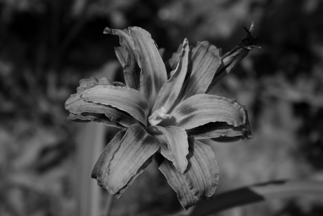
It looks like everyone hated the B&W... I agree it could have been better with more contrast, and I actually worked with it a little after it was suggested, and it does look much nicer that way.
As far as why B&W, since I was expecting 200+ flowers (as my title sugggests), I decided to do something that I was confident no one else would do. |
|
Comments Made During the Challenge  |
|
|
07/10/2005 03:53:04 PM |
| It just seems to be really lifeless. Maybe you could have left it color or made only the flower color.. |
|
 Photographer found comment helpful. Photographer found comment helpful. |
|
|
07/10/2005 11:05:24 AM |
| I like this very much...lilies have such a plush texture....but ...I think the contrast needs some work..there are no real whites in this image to add any kind of pop or depth...it's a bit "flat"...you don't need much white...just some highlights here and there, but I think it would make a hige difference in the end. |
|
| Photographer found comment helpful. |
|
|
07/09/2005 08:57:17 AM |
| I like the dark processing here, but I am a bit odd. Honestly, I wonder about the choice of processing since it isn't something you would normally see in a flower shot - I mean it's harsh, contrasty, and black&white. Certainly a bold choice. As far as cropping goes, I think a closer cut would be nice, so as to eliminate some of the extra space on the sides. For the most part, I do like this shot, despite my grumblings. Good luck in the challenge and happy shooting. |
|
| Photographer found comment helpful. |
|
|
07/08/2005 06:49:02 PM |
| The tones of the B&W are great but the flower in front lacks a bit of exposure to properly pop out. Some weak macro flash might have worked very well here. |
|
| Photographer found comment helpful. |
|
|
07/08/2005 01:19:55 PM |
| Hey, I like your title. Nice that you chose black and white for this, I just think this treatment is a little dull and lacking punch. Nice original thinking though |
|
| Photographer found comment helpful. |
|
|
07/08/2005 01:19:52 PM |
|
| Photographer found comment helpful. |
|
|
07/08/2005 12:49:42 AM |
| Nice title... and you're right... I think this is number 203. Very nice framing but I'm not sure the use of black and white doesn't actually take away from what this image could be. Nice subject. |
|
| Photographer found comment helpful. |
|
|
07/06/2005 06:48:04 PM |
| This photo is nice, but the black/white looks a bit muddy. I would think that it would look better with color instead. |
|
| Photographer found comment helpful. |
|
|
07/06/2005 03:07:03 AM |
| Should have boosted the contrast. Feels a bit dull. |
|
| Photographer found comment helpful. |
|
|
07/04/2005 06:57:19 PM |
| IMHO poor contast, subject is to centered, and why B&W? |
|
| Photographer found comment helpful. |
|
|
07/04/2005 10:17:10 AM |
| While I think the B&W looks kinda neat, there' s not enough separation in focusing for the flower to stand out from the background. It all kind of blends together. |
|
| Photographer found comment helpful. |
|
|
07/04/2005 03:37:22 AM |
| Excellent feel to this shot , I think it should have been cropped more because the empty space is not being used to enhance the shot. |
|
| Photographer found comment helpful. |
|
|
07/04/2005 03:07:10 AM |
| I counted 70 flower shots (not counting the ones with bugs) in this challenge. This one, I would have scored it higher if it would have been in color. Doesn't make for a very interesting B&W. The texture makes it look silk. Subject is very centered in the frame. Nice focus, though. |
|
| Photographer found comment helpful. |
|
|
07/04/2005 02:32:03 AM |
| I think that the composition would be stronger if the flower were less central. Also, because there isn't a whole lot of contrast in the image, it would probably look better in colour, since in black and white, its tonal range is a bit too limited to be really effective. |
|
| Photographer found comment helpful. |
Home -
Challenges -
Community -
League -
Photos -
Cameras -
Lenses -
Learn -
Help -
Terms of Use -
Privacy -
Top ^
DPChallenge, and website content and design, Copyright © 2001-2026 Challenging Technologies, LLC.
All digital photo copyrights belong to the photographers and may not be used without permission.
Current Server Time: 02/01/2026 08:13:49 AM EST.