| Author | Thread |
Comments Made During the Challenge  |
|
|
05/06/2005 06:21:53 PM |
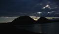
| the subject is nice, but the only problem with this photo is that its occupying very little space in the photo....its centered and gives a very bland look |
|
|
|
05/06/2005 10:20:35 AM |
|
|
|
05/05/2005 01:45:14 PM |
| poor composition distracts from solid attempt |
|
|
|
05/05/2005 12:44:20 PM |
|
|
|
05/04/2005 09:26:31 PM |
| I would crop the empty space on both sides. |
|
|
|
05/04/2005 08:11:12 PM |
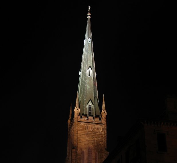
| The tower is not angled enough to make a statement, but enough to bother me. |
|
|
|
05/04/2005 05:13:29 PM |
| I would have liked to see the tower in more of a portrait shot. |
|
|
|
05/04/2005 01:27:51 PM |
| I think this is really pretty against the total blackness. |
|
|
|
05/04/2005 01:00:19 PM |
| Your technique is good, but churches are a bit played out. |
|
|
|
05/04/2005 07:23:21 AM |
| I like the slight off perpendicular tilt of this photo, but some will find it objectionable. What my eye wants to see is the cross in light/dark contrast at the top of the steeple. Great concept! Blessings! |
|
|
|
05/03/2005 10:38:15 PM |
| I like the fact that this is not a straight-on shot and that you can see the depth of the steeple. Maybe you should have cropped it so it wasn't centered and corrected the tilt. |
|
|
|
05/03/2005 09:04:03 PM |
| tooo much black space on the sides |
|
|
|
05/03/2005 09:00:15 PM |
| think i'd like this in 1/3 of frame..not so centered...nice steeple...7 |
|
|
|
05/03/2005 08:09:58 PM |
| YOu might want to rotate this to make the tower straight up and down, otherwise great photo |
|
Home -
Challenges -
Community -
League -
Photos -
Cameras -
Lenses -
Learn -
Help -
Terms of Use -
Privacy -
Top ^
DPChallenge, and website content and design, Copyright © 2001-2025 Challenging Technologies, LLC.
All digital photo copyrights belong to the photographers and may not be used without permission.
Current Server Time: 04/07/2025 01:28:57 AM EDT.