| Author | Thread |
Comments Made During the Challenge  |
|
|
04/13/2003 01:39:19 PM |
| Good photo. Not sure about choice of subject (lacking in impact because of it, IMO). |
|
|
|
04/12/2003 08:39:21 PM |
| color doesnt seem to be dominant here |
|
|
|
04/12/2003 03:17:59 AM |
| lol. Very interesting perspective shots. I like it. |
|
|
|
04/11/2003 09:40:12 AM |
|
|
|
04/10/2003 10:02:42 PM |
| Nice composition. I like this picture alot, but I think the colour association is a stretch. Very well done, and good luck on the Blue ribbon... |
|
|
|
04/10/2003 08:42:13 PM |
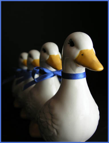
| quack quack quack.. notice i only had three. I don't cae for that far back one. Nice shot, tho |
|
|
|
04/10/2003 09:40:13 AM |
Quack! Very funny and good dof.
Is there a reason for the missing bow-tie on the first duck? Perhaps he is the male in the group - or the leader (",). // 7 // |
|
|
|
04/09/2003 05:24:24 PM |
| Great picture... could be a little clearer. |
|
|
|
04/09/2003 07:19:12 AM |
|
|
|
04/09/2003 06:26:33 AM |
|
|
|
04/09/2003 04:54:08 AM |
| Well we've all got a chance at getting the blue ribbon here, but I see you already have 4 of them :-) Nice pic, the border fits in well. |
|
|
|
04/08/2003 07:59:32 PM |
| Why doesn't the front duck have a bow? And why do have so many identical ducks? I likw the composiiton and it meets the challenge. Downsides are lighting could be brighter and the front duck could be in sharp focus. |
|
 Photographer found comment helpful. Photographer found comment helpful. |
|
|
04/08/2003 07:27:14 PM |
This picture would work as well for the symmetry challenge as it does for the color challenge. I like the soft lighting but I wish the lead duck was a bit sharper. I would also have cropped it to leave some space in front of the lead duck for him to swim into. It might have also helped to have a very diminished light source on the left side of the camera to illuminate the visible side of the ducks� faces but not so strong to compete with the main light. I gave this one a 6.
Greg
|
|
| Photographer found comment helpful. |
|
|
04/08/2003 04:49:44 PM |
| The bottom of the front one should have been with the composition I think. |
|
|
|
04/08/2003 12:21:03 PM |
| Sorry I just don't understand the pic. Something is missing,like the side and back of pic. it lacks clarity. |
|
|
|
04/08/2003 10:17:34 AM |
| nice job nice use of color |
|
|
|
04/07/2003 11:44:37 PM |
| I think the ducks could use more light/highlights. Great Idea though. |
|
|
|
04/07/2003 09:23:28 PM |
| this is a very clever photo but does not have enough 'colour' for me to rate highly in this challenge. |
|
|
|
04/07/2003 03:57:16 PM |
|
|
|
04/07/2003 03:25:11 PM |
|
|
|
04/07/2003 02:08:35 PM |
| Nicely lit. Good perspective. |
|
|
|
04/07/2003 01:00:13 PM |
| A little under exposed, but very interesting picture anyway. Maybe better if you showed more of the bottom of the first duck (ie. center the near duck). |
|
| Photographer found comment helpful. |
|
|
04/07/2003 10:50:19 AM |
| Perfect focus. Wish there was a bit more light, but not much - it's emerging from the dark, which is good (imho). |
|
|
|
04/07/2003 09:46:13 AM |
| nice image, this is creative, good job |
|
|
|
04/07/2003 08:57:51 AM |
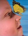
| Good colors, but the eye isn't lit and that bugs me just a bit. I feel we need to see his eye....MHO. Cute shot. |
|
| Photographer found comment helpful. |
|
|
04/07/2003 08:49:13 AM |
| Good use of dof. But i don't like the composition or the colors/lights. |
|
|
|
04/07/2003 08:44:25 AM |
| Nice perspective and good composition |
|
|
|
04/07/2003 06:25:18 AM |
|
Home -
Challenges -
Community -
League -
Photos -
Cameras -
Lenses -
Learn -
Help -
Terms of Use -
Privacy -
Top ^
DPChallenge, and website content and design, Copyright © 2001-2025 Challenging Technologies, LLC.
All digital photo copyrights belong to the photographers and may not be used without permission.
Current Server Time: 04/08/2025 01:32:51 AM EDT.