| Author | Thread |
Comments Made During the Challenge  |
|
|
05/03/2005 05:15:23 PM |
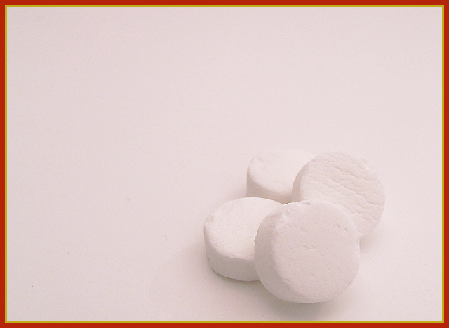
| I don't care for the border. |
|
 Photographer found comment helpful. Photographer found comment helpful. |
|
|
05/03/2005 02:03:09 PM |
|
| Photographer found comment helpful. |
|
|
05/03/2005 05:27:12 AM |
|
| Photographer found comment helpful. |
|
|
05/02/2005 08:02:43 PM |
| I personally don't care for this border with this shot. |
|
| Photographer found comment helpful. |
|
|
05/01/2005 07:10:39 AM |
| Too much red in the white balance |
|
| Photographer found comment helpful. |
|
|
05/01/2005 06:57:09 AM |
| I would like this photo much more without the border... |
|
| Photographer found comment helpful. |
|
|
05/01/2005 05:02:33 AM |
| I think you have a good idea here, but the white on white is uninteresting. |
|
| Photographer found comment helpful. |
|
|
04/30/2005 01:18:57 PM |
| well done, but I think you hurt the effect of the minimalist photograph with the garish frame. |
|
| Photographer found comment helpful. |
|
|
04/30/2005 01:05:01 AM |
| The border really distracts from the image. I am trying just to see the mints, but can't because of the border. 4 |
|
| Photographer found comment helpful. |
|
|
04/29/2005 11:22:20 PM |
OK... In spite of the border which IMHO is destracting from this awesome image, you made my wallpaper...Great job on a difficult exposure!
TC |
|
| Photographer found comment helpful. |
|
|
04/29/2005 10:29:25 PM |
| Like the use of white. Well executed shot. Don't like the border. |
|
| Photographer found comment helpful. |
|
|
04/29/2005 08:48:25 PM |
| Is everyone telling you that this border doesn't work well with this image? Okay, then I won't bother making that point. ;-) The image itself is a really good example of both a small subject and a white-on-white photo, which works well for either definition of minimalism that you choose. Very nicely done! |
|
| Photographer found comment helpful. |
|
|
04/29/2005 07:47:48 PM |
|
| Photographer found comment helpful. |
|
|
04/29/2005 02:44:14 PM |
| I like the way the mints are almost a texture in the photo almost blending into the back ground. Very interesting. |
|
| Photographer found comment helpful. |
|
|
04/29/2005 12:45:27 PM |
| Very nice. Like the white on white, it definitely fits the theme. I like the composition and think its just an all around good entry. |
|
| Photographer found comment helpful. |
|
|
04/29/2005 01:40:16 AM |
| nice idea. not sure about the colour tint. Maybe a green (Mint) cast would have worked better IMHO. 5 |
|
| Photographer found comment helpful. |
|
|
04/28/2005 08:41:13 PM |
|
| Photographer found comment helpful. |
|
|
04/28/2005 05:50:45 PM |
| I think this would have looked better with a dark border. Otherwise, a nice picture. |
|
| Photographer found comment helpful. |
|
|
04/28/2005 12:39:00 PM |
| Extra strong ! think I would have liked this better without the border |
|
| Photographer found comment helpful. |
|
|
04/28/2005 12:20:45 PM |
| lose the border; too distracting. Perhaps some more contrast or a little stronger lighting, or maybe not, im not sure, this is a strange image. a little too pink too. 4 |
|
| Photographer found comment helpful. |
|
|
04/28/2005 11:35:57 AM |
| Looks like this would make a great advertisement shot. Deffinatly fits the minimalism theme. |
|
| Photographer found comment helpful. |
|
|
04/28/2005 09:32:52 AM |
| Good one, can you add borders on basic editing? |
|
| Photographer found comment helpful. |
|
|
04/28/2005 09:02:44 AM |
|
| Photographer found comment helpful. |
|
|
04/28/2005 07:44:25 AM |
| The picture is overall too gray. Shooting white on white is very difficult to do. I like how the border reminds me of altoids however. |
|
| Photographer found comment helpful. |
|
|
04/28/2005 05:51:23 AM |
| Has a slight colour pink colour cast. |
|
| Photographer found comment helpful. |
|
|
04/28/2005 05:49:53 AM |
| Dont care for the pink tint |
|
| Photographer found comment helpful. |
|
|
04/27/2005 09:55:17 PM |
| border is distracting...nice idea |
|
| Photographer found comment helpful. |
|
|
04/27/2005 09:34:51 PM |
| the dark orange border is a disaster imo. |
|
| Photographer found comment helpful. |
|
|
04/27/2005 09:18:06 PM |
|
| Photographer found comment helpful. |
|
|
04/27/2005 09:15:33 PM |
| i assume you're trying to mimick the altoids box by using that border. clever idea, but i don't think it works well here. it overpowers the otherwise great photo |
|
| Photographer found comment helpful. |
|
|
04/27/2005 07:12:37 PM |
| hmmm me thinks we stuck the fancy border to add to the dull image?? |
|
| Photographer found comment helpful. |
|
|
04/27/2005 07:07:37 PM |
| I think that perhaps stronger shadows off of the mints or that a different colored background would help this shot pop out a bit. I like the placement of the subject, and the image has good clarity. |
|
| Photographer found comment helpful. |
|
|
04/27/2005 07:00:14 PM |
| I'm sure I'm the first to tell you this... :) but the border...? Whoa! |
|
| Photographer found comment helpful. |
|
|
04/27/2005 06:51:34 PM |
| Funny! Border is horrible (sorry!). But great title, and nice idea. |
|
| Photographer found comment helpful. |
|
|
04/27/2005 05:51:16 PM |
| This is great and funny too Very crisp! |
|
| Photographer found comment helpful. |
|
|
04/27/2005 09:39:35 AM |
|
| Photographer found comment helpful. |
|
|
04/27/2005 08:04:49 AM |
| funny, but ohhh that border! Ouch! |
|
| Photographer found comment helpful. |
|
|
04/27/2005 07:00:05 AM |
| LOL...love the title. Love the mints!!! |
|
| Photographer found comment helpful. |
|
|
04/27/2005 06:10:23 AM |
| would prefer a simpler border |
|
| Photographer found comment helpful. |
|
|
04/27/2005 05:53:46 AM |
| The white doesn't seem white enough. |
|
| Photographer found comment helpful. |
|
|
04/27/2005 04:25:14 AM |
|
| Photographer found comment helpful. |
|
|
04/27/2005 02:40:23 AM |
| AHAHAHA Love your title to go along with this great shot! :) |
|
| Photographer found comment helpful. |
|
|
04/26/2005 10:43:51 PM |
| I love it when people go the extra bit and take a challenge beyond the literal into the world of word play. Good job with the shot & title. That border looks terrible though, IMO. Disregarding border for grading, though. :) |
|
| Photographer found comment helpful. |
|
|
04/26/2005 10:08:21 PM |
| I really like the minimalism of the picture. The yellow and red border just doesn't seem to match the mood of the picture. |
|
| Photographer found comment helpful. |
|
|
04/26/2005 09:03:06 PM |
| The border definately takes away from this photo. The white on white would have been so much better without it. |
|
| Photographer found comment helpful. |
|
|
04/26/2005 08:43:20 PM |
| Cut eidea, clever title. Probably should've just used one or two and smaller. |
|
| Photographer found comment helpful. |
|
|
04/26/2005 08:27:27 PM |
| Very nice... However, I do not care for this border... it really does not add to the photo - I did not take off for it. =) I just think that the colors of it do not look right and takes away from your photo. Otherwise I think you did a very good job. =) |
|
| Photographer found comment helpful. |
Home -
Challenges -
Community -
League -
Photos -
Cameras -
Lenses -
Learn -
Help -
Terms of Use -
Privacy -
Top ^
DPChallenge, and website content and design, Copyright © 2001-2025 Challenging Technologies, LLC.
All digital photo copyrights belong to the photographers and may not be used without permission.
Current Server Time: 04/07/2025 04:48:50 AM EDT.