| Author | Thread |
Comments Made During the Challenge  |
|
|
05/03/2005 07:00:40 PM |
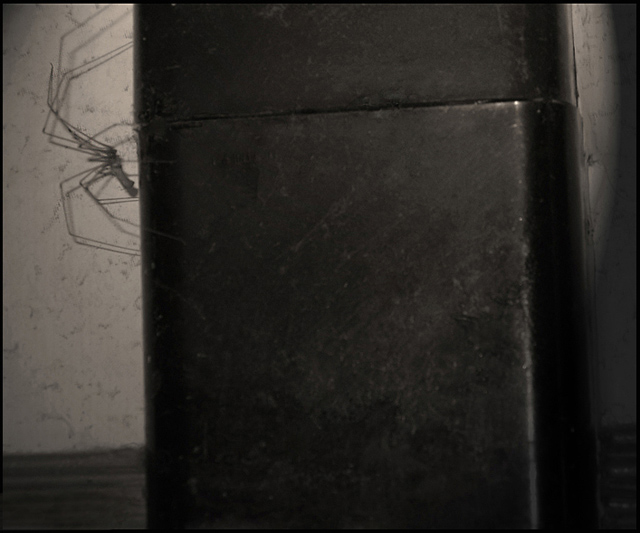
| The photo has a late night "surprise!" feel to it. The colors and detail are muddy and the lighting too dim yet harsh. But your composition is solid if those oher elements were fixed - I like how blocky the frame is laid out. |
|
|
|
05/02/2005 06:46:51 PM |
| yuck, looks like this is a very big spider, if it is your should maybe have included something in the picture to help us see how big it is |
|
|
|
05/01/2005 12:25:29 AM |
I'm sure you've heard this by now but...
"The spider is blurry!!! Waaahhh!!!" |
|
|
|
04/30/2005 11:53:45 PM |
|
|
|
04/30/2005 07:48:47 PM |
| This is amusing and wierd. I'm trying to understand what the large black area is in the foreground, its kinda distracting. Otherwise - fun. |
|
|
|
04/30/2005 07:12:15 AM |
| what a creepy looking little guy |
|
|
|
04/29/2005 03:01:22 PM |
| creepy--gives me a shiver and I am not afraid od spiders. |
|
|
|
04/29/2005 11:21:09 AM |
|
|
|
04/29/2005 02:40:29 AM |
| low contrast, and the spider should've been in better focus |
|
|
|
04/28/2005 12:28:36 PM |
| Washed out. The vertical lines split the picture in an unfortunate way IMO. The subject seems that can not balance the composition. The shadows and the spots on the background are distracting. |
|
|
|
04/28/2005 10:39:25 AM |
| Unfortunately this is one of those shots that really doesn't 'speak' to me. I don't like the overall hue - I would have preferred this in color or in a less purply B&W (keep in mind that my monitor may differ from yours). The highlights on the right hand side distract from the spider, and while I know it's difficult to capture them sometimes, the spider would have been much clearer had you been able to catch it sitting still. |
|
 Photographer found comment helpful. Photographer found comment helpful. |
|
|
04/27/2005 06:36:17 PM |
|
|
|
04/27/2005 01:27:56 PM |
| nice, but seems a bit blurry - could be out of focus, or is it due to fast movement? |
|
|
|
04/27/2005 09:35:07 AM |
| geez I hate spiders but I really LOVE this image! 9 |
|
|
|
04/27/2005 09:27:40 AM |
| A difficult image to comment on really, it has simplicity and is minimal, but the elegance I associate with minimalism is lacking |
|
Home -
Challenges -
Community -
League -
Photos -
Cameras -
Lenses -
Learn -
Help -
Terms of Use -
Privacy -
Top ^
DPChallenge, and website content and design, Copyright © 2001-2026 Challenging Technologies, LLC.
All digital photo copyrights belong to the photographers and may not be used without permission.
Current Server Time: 02/01/2026 09:54:29 AM EST.