| Author | Thread |
Comments Made During the Challenge  |
|
|
05/01/2005 07:35:29 PM |
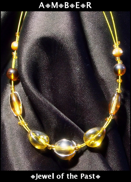
| Great presentation. Just a tad bit softer lighting would have brought more detail on the gems. Bumping up. |
|
 Photographer found comment helpful. Photographer found comment helpful. |
|
|
05/01/2005 05:44:11 PM |
| The glare on the stones is distracting. |
|
| Photographer found comment helpful. |
|
|
05/01/2005 12:03:15 AM |
| Lighting is very harsh and the jewels are not very sharp. Text is simple but not very interesting. (like the little dots). 5 |
|
| Photographer found comment helpful. |
|
|
04/30/2005 07:55:37 PM |
| the highlights detract from a fine image. |
|
| Photographer found comment helpful. |
|
|
04/30/2005 01:40:02 PM |
| I love amber ... The lighting seems a little too harsh. I like that you used black to try to bring out the color of the jewels, but that bottom one seems to be reflecting too much light. |
|
| Photographer found comment helpful. |
|
|
04/29/2005 02:01:48 PM |
| Yeah for Denmark! Lighting is overly harsh in places, and works very well in other places. Nice layout. |
|
| Photographer found comment helpful. |
|
|
04/29/2005 10:07:57 AM |
| The fold in the fabric is distracting to me, as it seems as though it is hiding something. Perhaps if this necklace were photographed around someone's neck, it would have been more pleasing. The amber looks a bit washed out to me, but overall, it has a nice color. Also, it appears to be glowing - nice touch. |
|
| Photographer found comment helpful. |
|
|
04/29/2005 07:08:48 AM |
| Very nice. I wish the light had been softened with a piece of paper to avoid the harsh glare on the amber. I like the texture on the cloth is is sitting on 8 |
|
| Photographer found comment helpful. |
|
|
04/29/2005 01:57:37 AM |
| Maybe the background is a little washed out. |
|
| Photographer found comment helpful. |
|
|
04/28/2005 08:34:44 PM |
| Not very special. Fabric a bit too shiny. |
|
| Photographer found comment helpful. |
|
|
04/28/2005 04:37:29 PM |
| when i think of amber i think of a richly colored stone with intricate details in it....im not able to see that here due to the lighting |
|
| Photographer found comment helpful. |
|
|
04/28/2005 08:18:35 AM |
| A good add! I find the texture of the cloth a little distracting, but not too much. I think the lighting is just right, the highlights on the beads are quite bright but by no means over the top. Hope you do well. |
|
| Photographer found comment helpful. |
|
|
04/27/2005 09:24:15 PM |
| To really make this work, the background's texture needs to be more plain. The weave of the cloth is too prominent. I like the concept, but a darker piece of cloth would improve it. |
|
| Photographer found comment helpful. |
|
|
04/27/2005 02:44:12 AM |
| hm. Looking at the top, I read "AoMoBoEoR" |
|
| Photographer found comment helpful. |
|
|
04/27/2005 12:42:20 AM |
| Lovely reflection of light. |
|
| Photographer found comment helpful. |
|
|
04/26/2005 06:49:02 PM |
| The comp is great and you chose excellent fonts to make the ad. A different backdrop with less reflection would make this a viable professional ad. |
|
| Photographer found comment helpful. |
|
|
04/26/2005 03:51:56 PM |
| I like the way you've framed this and have the text in a border area outside of the image. The jewelry has a few hot spots from lighting which makes it seem a bit out of focus in comparison to the backdrop used. Overall a nice photo. Good luck. |
|
| Photographer found comment helpful. |
|
|
04/26/2005 02:01:57 PM |
| Great idea, but the focus seems to be sharpest on the background. |
|
| Photographer found comment helpful. |
|
|
04/25/2005 08:01:59 PM |
| I think this is an interesting subject, though I don't particularily care for the lighting in this shot, a bit too bright. |
|
| Photographer found comment helpful. |
|
|
04/25/2005 05:17:50 PM |
Composition and background are good here. The arrangement of the folds in the cloth background are nicely done.
Text/font in the wording could be improved upon in my opinion. |
|
| Photographer found comment helpful. |
|
|
04/25/2005 01:23:50 PM |
| I think this one would be better with the text on the photo and it is to far apart 7 |
|
| Photographer found comment helpful. |
|
|
04/25/2005 10:17:50 AM |
| nice shot but the light on the middle stone takes away from it's natural color. |
|
| Photographer found comment helpful. |
|
|
04/25/2005 06:23:17 AM |
| Interesting, but black material far too distracting for me. Yellows blown in places and middle jewel strangely overexposed. |
|
| Photographer found comment helpful. |
|
|
04/25/2005 01:57:18 AM |
| Nice shot. The amber could be more in focus, rather then the cloth. |
|
| Photographer found comment helpful. |
|
|
04/25/2005 01:29:46 AM |
|
| Photographer found comment helpful. |
|
|
04/25/2005 01:13:38 AM |
| I'de buy it from this add, great |
|
| Photographer found comment helpful. |
|
|
04/25/2005 12:16:29 AM |
| too bright...harsh lighting... |
|
| Photographer found comment helpful. |
Home -
Challenges -
Community -
League -
Photos -
Cameras -
Lenses -
Learn -
Help -
Terms of Use -
Privacy -
Top ^
DPChallenge, and website content and design, Copyright © 2001-2026 Challenging Technologies, LLC.
All digital photo copyrights belong to the photographers and may not be used without permission.
Current Server Time: 02/01/2026 08:22:44 AM EST.