| Author | Thread |
Comments Made During the Challenge  |
|
|
04/19/2005 05:34:58 PM |
| Great texture and contrast. |
|
|
|
04/19/2005 02:49:00 AM |
| the top and bottom contrast a bit too much and honestly it confused me when i first saw it!! cut it in half and zoom out and youll have two perfect pictures. thats just me though. very unique building congrats |
|
 Photographer found comment helpful. Photographer found comment helpful. |
|
|
04/18/2005 09:49:41 AM |
| This is a nice image. I really like the contrast seen here. Good work. |
|
| Photographer found comment helpful. |
|
|
04/18/2005 09:42:28 AM |
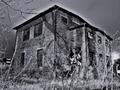
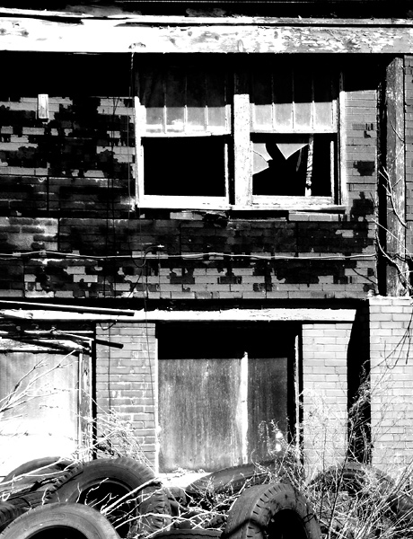
| I like this image because of the tires in the front of the building, it looks nice and the textuer in the building is neat. The broken window looks good as well. nice shot. |
|
| Photographer found comment helpful. |
|
|
04/16/2005 04:24:54 PM |
Far too contrasty, detail in the highlights has been lost trying a new teqhnique and brave enough to do so 7.I dont thik this type of suject suits the style you are after.
4 |
|
| Photographer found comment helpful. |
|
|
04/16/2005 11:27:57 AM |
| The hotspots on the facia and the lower left hurt this one. Good photo. I like the crop. |
|
| Photographer found comment helpful. |
|
|
04/14/2005 11:34:52 PM |
Great composition and depiction of urban decay in the neighborhood. Your choice for making it a B&W was a wise one.
Well Done! |
|
| Photographer found comment helpful. |
|
|
04/14/2005 05:48:39 PM |
| Excellent closeup for thic challenge. You'll notice that most of the photos are of whole buildings. This shot stands out among the few that bring us closer to abandonment. |
|
| Photographer found comment helpful. |
Home -
Challenges -
Community -
League -
Photos -
Cameras -
Lenses -
Learn -
Help -
Terms of Use -
Privacy -
Top ^
DPChallenge, and website content and design, Copyright © 2001-2026 Challenging Technologies, LLC.
All digital photo copyrights belong to the photographers and may not be used without permission.
Current Server Time: 02/01/2026 12:13:18 PM EST.