| Author | Thread |
Comments Made During the Challenge  |
|
|
04/19/2005 02:12:38 PM |
| This seems a little out of focus (unless my eyes are going). |
|
 Photographer found comment helpful. Photographer found comment helpful. |
|
|
04/19/2005 04:38:33 AM |
| This seems soft. A little more contrast would have helped also. |
|
| Photographer found comment helpful. |
|
|
04/18/2005 06:36:19 AM |
|
| Photographer found comment helpful. |
|
|
04/17/2005 11:51:37 PM |
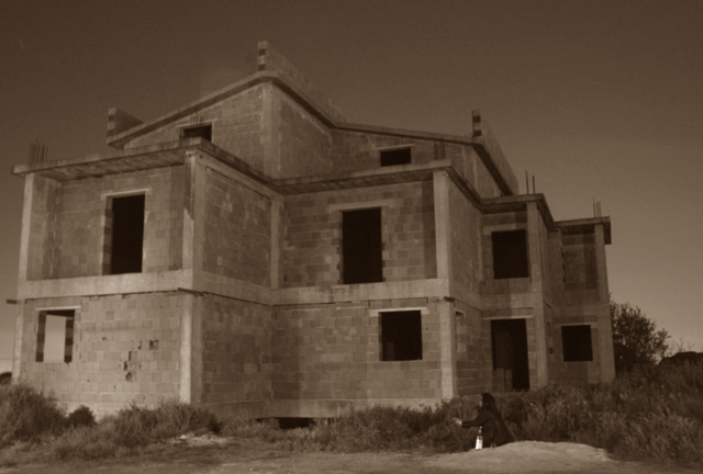
Toning seems a bit off / too dark / lacking contrast in my opinion.
Was this shot through a window or similar? Looks to be some square reflection area just to the left of the ridge. |
|
| Photographer found comment helpful. |
|
|
04/17/2005 12:54:52 PM |
| i think this might be a little too dark..my eye is drawn to the peak of the building by the transparent white square...but i like the angle of the photo and the look i think you were going for. |
|
| Photographer found comment helpful. |
|
|
04/15/2005 11:05:55 PM |
| focus is too soft for my taste. I like the color tones, though. |
|
| Photographer found comment helpful. |
|
|
04/15/2005 02:31:00 PM |
| Nice composition. Shows the building is abandoned. A little on the dark side, try lightening it up a little. Like the tone of the photograph. |
|
| Photographer found comment helpful. |
|
|
04/15/2005 11:15:54 AM |
It looks as this was shot through a car window - am I right here?
Anyway, I think it would have been better to go a bit to the left and shoot the front of the house straight on. I think that would have looked neat because of the step-like form of the house. Including some background or foreground would also have been helpful here. If the woman on to the right had been somewhat closer to the camera this could have been a nice photo.
It also irritates me a bit that you have angled the camera upwards here. Better to shoot at a greater distance and crop the lower portion off the picture.
In addition the photograph is too soft but I like the toning though the effect is perhaps a tad strong for my taste. |
|
| Photographer found comment helpful. |
|
|
04/15/2005 02:59:41 AM |
|
| Photographer found comment helpful. |
|
|
04/14/2005 07:05:52 PM |
| I see some compression problems, camera shake (was it windy?) and what is that splotch to the left of the peak of the roof. Also, this looks more like new construction rather than an abandoned building. |
|
| Photographer found comment helpful. |
|
|
04/14/2005 04:37:15 PM |
| The colors are interesting, but I see a shadow ro something on the top of the building somewhere near the center. Still like it. |
|
| Photographer found comment helpful. |
|
|
04/13/2005 12:50:17 PM |
| Wow! Why would anyone abandon such a cool building! I love the cepia tone to this. It really enhances the abandoned feeling! |
|
| Photographer found comment helpful. |
Home -
Challenges -
Community -
League -
Photos -
Cameras -
Lenses -
Learn -
Help -
Terms of Use -
Privacy -
Top ^
DPChallenge, and website content and design, Copyright © 2001-2025 Challenging Technologies, LLC.
All digital photo copyrights belong to the photographers and may not be used without permission.
Current Server Time: 04/07/2025 02:55:26 AM EDT.