| Author | Thread |
Comments Made During the Challenge  |
|
|
04/03/2005 05:36:35 PM |
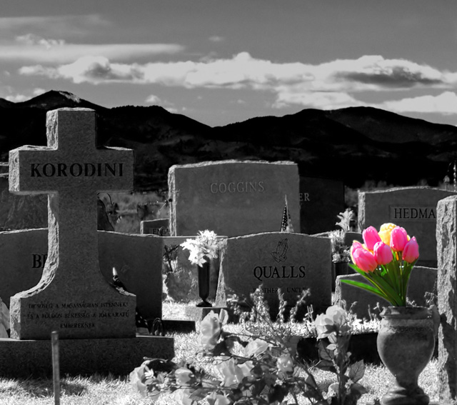
| Bumping up to 6. I like this image very much because the composition and lighting work very well, however, the desat does not appear to blend in and complete the image. The composition is great. |
|
 Photographer found comment helpful. Photographer found comment helpful. |
|
|
04/03/2005 12:57:54 PM |
Nice SD ,the flowers in the foreground are a bit distracting.like the mountains in the background.
Message edited by author 2005-04-04 12:03:41. |
|
| Photographer found comment helpful. |
|
|
04/02/2005 01:21:41 PM |
| Nice concept, but I think it's overdone. Less saturated flowers might look better, or possibly different colors. |
|
| Photographer found comment helpful. |
|
|
04/02/2005 05:39:54 AM |
| This is my second go-around =) - excellent choice of location! I really like your composition, use of b&w w/selective color. Very nice! |
|
| Photographer found comment helpful. |
|
|
04/01/2005 02:01:25 PM |
| I think this is an amazing composition, and great tonal range and lighting captured. My two nit-picks are that the flowers are too bright and plastic looking for me (I think I would have not kept them in color) and the foreground details a bit soft for my taste. |
|
| Photographer found comment helpful. |
|
|
03/31/2005 02:34:20 AM |
| Good graveyard and clear capture. Maybe a bit too much colour there in the non-desat part (on my monitor). And in a funny position - maybe woud have been better if on a thirds line. Not sure that the backlighting is really working here. |
|
| Photographer found comment helpful. |
|
|
03/29/2005 10:38:32 AM |
| Loved the photo! I wonder what it would look like if more of the flowers were color but faded in Saturation as they are further away from the tulips?? One of my top picks! |
|
| Photographer found comment helpful. |
|
|
03/29/2005 06:02:25 AM |
I am making two passes on this Challenge. I will vote on your photo then return later(before voting is over) to comment on what I like and dislike about your shot. You can take the comments however you wish and I will try not to be mean. Just don't take it the wrong way.
--------------------------------------------------------------------------------------------------------------
I like it. Love how you left the color in the flowers. Good job. |
|
| Photographer found comment helpful. |
|
|
03/28/2005 07:25:17 AM |
A good overall picture, but personally I don't like the colored tuips.
The tombstones look a little dark too.
The background of mountains is great as are the clouds. |
|
| Photographer found comment helpful. |
|
|
03/28/2005 07:10:14 AM |
| I like the contrast and backlighting, but in this case I feel the color detracts rather than adds to shot. |
|
| Photographer found comment helpful. |
Home -
Challenges -
Community -
League -
Photos -
Cameras -
Lenses -
Learn -
Help -
Terms of Use -
Privacy -
Top ^
DPChallenge, and website content and design, Copyright © 2001-2025 Challenging Technologies, LLC.
All digital photo copyrights belong to the photographers and may not be used without permission.
Current Server Time: 04/07/2025 02:01:00 AM EDT.