| Author | Thread |
|
|
04/04/2003 02:56:19 PM |
Critique Club Critique by Tim Jensen
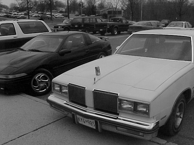
The idea behind this photo is a pretty good one. I love cars and I think since there are so many variations the idea of contrasting an old car with a new one to represent time is pretty good. However, the main problem I have with this photo is that the theme is not very clear by looking at the photo itself. I'm also very unclear as to what the can has to do with the photo unless that is really part of your theme. I just can't completely figure it all out. You would need to figure out a more effective way to convey your idea. A tighter cropping to eliminate unwanted background elements and a more interesting composition and perspective could help improve on this.
I would also have preferred color in this photo unless the above suggestions were used and there was more contrast. As it is there just doesn't seem to be a strong reason to use B&W. Color would help it pop out more and command more attention.
The execution is fairly good with some slight softness to the edges. It's pretty clean but needs more contrast as a B&W.
Overall I have to say this is a pretty ordinary photo but with plenty of potential. It needs much more creativity especially in regards to the composition and perspective. this way you can better grab the viewer's attention.
T |
|
Comments Made During the Challenge  |
|
|
03/30/2003 02:32:00 PM |
| I think the idea is stretched a bit here. I think the image would be more effective if you could have found an older car (50's era or older) and compared it with a newer car (the cars there are neither very old or very new...) I think the image is also cropped too tight on the left. Nice idea, but I think it could be improved. |
|
|
|
03/30/2003 01:09:30 PM |
|
|
|
03/27/2003 05:08:44 AM |
| B&W does nothing for this |
|
|
|
03/26/2003 07:28:53 PM |
| Have I seen this parking lot before? Focus seems O.K., contrast is not very strong. Challenge - requires title too much (photo could represent many things, time isn't the first thing that pops into my head). 5 Swash |
|
|
|
03/26/2003 12:40:31 PM |
| I really don't see the point in this picture...I know the subject is "old and new" but what's with the can on top of the car??????? |
|
|
|
03/26/2003 09:04:44 AM |
| I believe I understand your interpretation of the challenge in this photo... the tonal range, however, is very flat and the image is quite dark overall... maybe a different exposure or some level and contrast adjustment would bring it up nicely... - setzler |
|
|
|
03/25/2003 01:35:04 PM |
|
|
|
03/24/2003 05:52:02 PM |
| Not much artistic appeal, cropping out the background would improve it. Not enough light. |
|
|
|
03/24/2003 10:12:49 AM |
| nice pop/beer can. Is that the old or the new? Subject matter aside, photo is dark, Would benefit from level adjustment. |
|
Home -
Challenges -
Community -
League -
Photos -
Cameras -
Lenses -
Learn -
Help -
Terms of Use -
Privacy -
Top ^
DPChallenge, and website content and design, Copyright © 2001-2026 Challenging Technologies, LLC.
All digital photo copyrights belong to the photographers and may not be used without permission.
Current Server Time: 02/01/2026 12:00:46 PM EST.