| Author | Thread |
Comments Made During the Challenge  |
|
|
03/04/2005 03:01:53 PM |
| Gorgeous thet way you used the soft, blurred colors and textures. It was kept so perfectly simple that it has a huge impact and could easily be a billboard. A beautiful one! |
|
 Photographer found comment helpful. Photographer found comment helpful. |
|
|
03/03/2005 09:47:25 AM |
| Much graphical appeal. Nice soft effect. Well done! |
|
| Photographer found comment helpful. |
|
|
03/01/2005 07:51:07 PM |
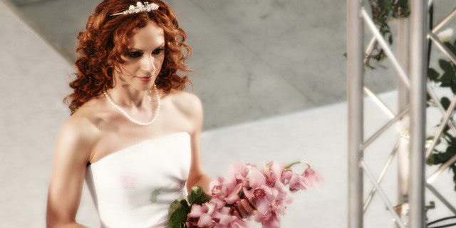
| great photo! i would have liked it even better if the scaffold could have been cropped out though |
|
| Photographer found comment helpful. |
|
|
03/01/2005 03:00:56 PM |
| something about the skin tones seems off, but the flowers and hair came out really nice. maybe the soft focus should have been limited to only the backround and flowers, because it seems too strong on the bride. 7 |
|
| Photographer found comment helpful. |
|
|
02/28/2005 04:36:20 PM |
ok, i am voting this challenge in 2 passes. in this pass, you will get a partial comment and a score. then i will come back to comment again. if you have any problem whatsoever with this comment, pm me and let me know. otherwise, take it with a grain of salt...i'm not trying to be a know-it-all, i'm just explaining where i'm coming from in voting this challenge. and, if this comment is NOT helpful (of if you think i'm full of $#!+), don't mark it helpful.
billboards are a science unto themselves. a lot of research has gone into determining just how much information a person can digest and retain in specific time spans. they use this information to develop formulas for determining the number of words and letters to use on billboards, as well as their sizes. they also determine the size and number of visual elements to include.
the graphics/photograph on a billboard are designed to get the point across in a moment. on the road, a driver will have less time with a billboard than a voter will give your image. this is a key element in the challenge: composing a shot that will get its point across quickly and succintly. along those lines, a strong composition will probably have few details and make strong use of negative space.
------------------
not really sure what i would get out of this at 60 mph. maybe a different perspective that gave me more of a feeling that it was a 'bride'? the structure on the right is a serious distraction. |
|
| Photographer found comment helpful. |
|
|
02/28/2005 07:16:34 AM |
| The Bride looks kinda plastic! :) |
|
| Photographer found comment helpful. |
|
|
02/28/2005 01:31:24 AM |
| would have been better without the stage rigging |
|
| Photographer found comment helpful. |
|
|
02/27/2005 08:07:39 PM |
AHHH. Over PSed on the bride. Love the hair.....but WAY too much done to her skin. Her face looks like its naturally beautiful but smoothed out to loot like a bad immitation of Michael Jackson. No offense at all to the girl. I'm sure the original does her more justice. Sorry!
Other than that....the composition is GREAT. Love the softer heavenly glow and the soft colors. Nice job overall. |
|
| Photographer found comment helpful. |
Home -
Challenges -
Community -
League -
Photos -
Cameras -
Lenses -
Learn -
Help -
Terms of Use -
Privacy -
Top ^
DPChallenge, and website content and design, Copyright © 2001-2025 Challenging Technologies, LLC.
All digital photo copyrights belong to the photographers and may not be used without permission.
Current Server Time: 04/07/2025 09:08:55 PM EDT.