| Author | Thread |
|
|
07/13/2006 05:57:28 PM |
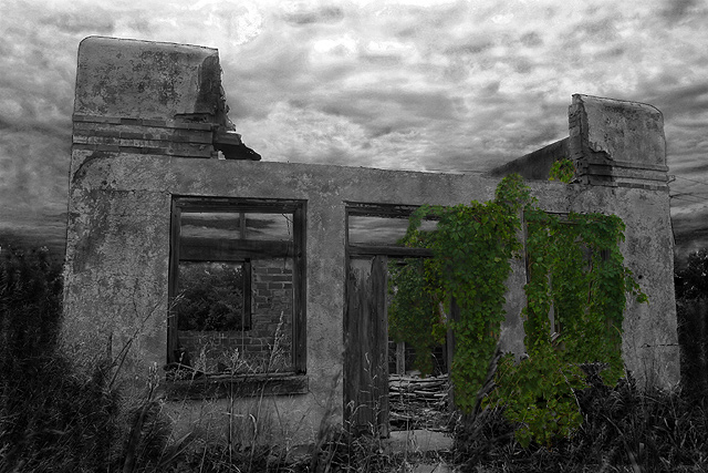
| I really like this picture. I have always been facinated with the "Modern Ruins" in my area. But alas, I am afraid of critters and snakes. :) |
|
Comments Made During the Challenge  |
|
|
01/30/2005 07:22:42 AM |
| Nice shot with lots of atmosphere, but I can't help feeling straight black and white would have looked better here. |
|
|
|
01/28/2005 05:17:55 AM |
| Too dark to create the mood! the pic has a lot of potential |
|
|
|
01/25/2005 05:14:25 PM |
| It seems a little too dark. |
|
|
|
01/24/2005 01:26:36 AM |
| what an interesting image. i love your composition and treatment of the image. good work. i will be surprised if this one gets overlooked. good luck! |
|
 Photographer found comment helpful. Photographer found comment helpful. |
|
|
01/23/2005 02:27:32 AM |
| Great subject, the selective desat is a good idea, though the focus on the vines doesn't seem to be the crispest and the desat brings that to my attention. Still, I like this...bumping to 7. |
|
| Photographer found comment helpful. |
|
|
01/22/2005 04:31:12 PM |
|
| Photographer found comment helpful. |
|
|
01/18/2005 01:53:41 AM |
| Judicious use of desat for once! |
|
| Photographer found comment helpful. |
|
|
01/16/2005 10:14:23 AM |
| Desatuaration works for me. It makes me think that there's something special about the vines growing all over the building, but I'm not sure what it is. |
|
| Photographer found comment helpful. |
|
|
01/16/2005 07:21:56 AM |
| Now, here's one shot that I think had been edited beyond what it deserved. The building springs against it's background in a manner that clashes with expectation - and it isn't flash, because it applies equally to the further walls. It looks to me that there were probably some fascinating textures and contrasts to be had around the left-most window, but that's lost in the lack of contrast there, and the eye anyway is pulled by the selective de-saturation. The sky has become weird, and looks almost painted in. It's evident that a lot of work has gone into this - but I'm afriad i'm really not a fan of the results of that. |
|
|
|
01/16/2005 03:43:56 AM |
| I really like this image and choice to use selective desaturation. The clouds strengthen the end result. Good job. |
|
| Photographer found comment helpful. |
Home -
Challenges -
Community -
League -
Photos -
Cameras -
Lenses -
Learn -
Help -
Terms of Use -
Privacy -
Top ^
DPChallenge, and website content and design, Copyright © 2001-2025 Challenging Technologies, LLC.
All digital photo copyrights belong to the photographers and may not be used without permission.
Current Server Time: 04/07/2025 02:26:26 PM EDT.