| Author | Thread |
Comments Made During the Challenge  |
|
|
03/09/2003 09:53:06 PM |
| I lik the light in this photo. |
|
 Photographer found comment helpful. Photographer found comment helpful. |
|
|
03/08/2003 01:45:51 PM |
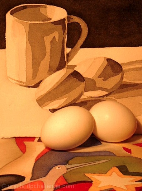
| An interesting and appropriate stylistic choice to have the eggs the same colors and tones at the illustrations behind them. Even harsher light and being more in focus would, I feel, increase the effectiveness and "illustrated" quality you were trying for here. |
|
| Photographer found comment helpful. |
|
|
03/06/2003 09:22:36 PM |
|
| Photographer found comment helpful. |
|
|
03/05/2003 01:59:31 AM |
| Pretty nice... A little too much of a yellowish color to everything. |
|
| Photographer found comment helpful. |
|
|
03/04/2003 07:44:47 PM |
| I really like the background and the eggs but the colorful foreground really takes away from it. Pretty cool shot. |
|
| Photographer found comment helpful. |
|
|
03/03/2003 06:59:40 PM |
| maybe the lighting is creating the poor contrast between the eggs and the background here... i'm not sure if that was intentional or not, but I would personally like this one better if the eggs stood out against that a little more... - setzler |
|
| Photographer found comment helpful. |
|
|
03/03/2003 06:27:06 PM |
| i think the bottom color pattern distracts from the photo, but the eggs with the top one go well together. |
|
| Photographer found comment helpful. |
|
|
03/03/2003 06:09:22 PM |
| Nice idea - but the colourisation of the real eggs makes it look like you've had to try too hard to get the effect. |
|
| Photographer found comment helpful. |
|
|
03/03/2003 05:03:43 PM |
|
| Photographer found comment helpful. |
|
|
03/03/2003 01:29:30 AM |
|
| Photographer found comment helpful. |
Home -
Challenges -
Community -
League -
Photos -
Cameras -
Lenses -
Learn -
Help -
Terms of Use -
Privacy -
Top ^
DPChallenge, and website content and design, Copyright © 2001-2026 Challenging Technologies, LLC.
All digital photo copyrights belong to the photographers and may not be used without permission.
Current Server Time: 02/01/2026 10:00:58 AM EST.