| Author | Thread |
Comments Made During the Challenge  |
|
|
12/21/2004 03:34:35 PM |
|
|
|
12/21/2004 03:32:36 PM |
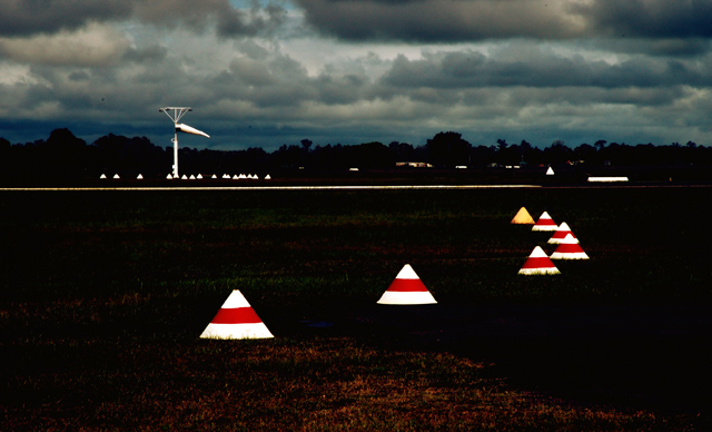
| The photo is quite appealing, although the title is "airport wind sock" so why is there all the rest of the stuff in there? The cones tell us its an airport runway, but they in no way help to allude to the fact that its showing wind. A closer cropping on the wind sock would have led the eye better. |
|
 Photographer found comment helpful. Photographer found comment helpful. |
|
|
12/21/2004 04:01:18 AM |
| Nice dramatic sky and light, a bit surreal with the markers. I think a zoom to the sock against the sky might have improved this--for Wind, the subject is too much a part of the background rather than a focal point. The markers seem to be the focal point here. |
|
| Photographer found comment helpful. |
|
|
12/20/2004 09:42:52 AM |
| I like the color and lighting effects in this one, but I think my eye is drawn more to the lights than to the sock itself. |
|
| Photographer found comment helpful. |
|
|
12/19/2004 05:40:10 PM |
| Good place, but will be prefered with a plane (or more visible)! |
|
| Photographer found comment helpful. |
|
|
12/19/2004 04:12:30 PM |
| interesting. i really like the contrasts you captured in this shot. |
|
| Photographer found comment helpful. |
|
|
12/18/2004 05:39:33 PM |
| YOU CAPTURED THE THEME,NICE COLORS WITH THE CONES BUT NOT VERY EXCITING ELEMENTS. |
|
| Photographer found comment helpful. |
|
|
12/17/2004 09:23:51 PM |
| Good idea, but the composition is bad - the item you want me to see is too small and a very isignificant part of the whole image. The reflective cones catch my eye, and lead me off to the right, not to the windsock. the horizontal white line (lights in motion?) cut the pic in 1/2. My eye wants to stay low. |
|
| Photographer found comment helpful. |
|
|
12/17/2004 03:02:13 PM |
| My eyes are more drawn towards the cones in the front of the picture rather than the wind sock. |
|
| Photographer found comment helpful. |
|
|
12/16/2004 10:08:37 PM |
| This is a bit over contrasted. |
|
| Photographer found comment helpful. |
|
|
12/16/2004 01:52:27 AM |
| The wind sock is a great idea for a subject -- I just find it too small in this photo -- overwhelmed by the foreground which is considerably less interesting. Could be improved if we saw more of a runway, or an airplane. Otherwise, a tighter shot of the sock would be an improvement -- perhaps looking up towards the sky since the clouds in this photo are far more inspiring than the ground in this particular setting. |
|
| Photographer found comment helpful. |
|
|
12/15/2004 08:55:51 PM |
| The wind sock is so small...a tighter shot would have been better. The cones (or whatever those are) are interesting, but if the windsock is your primary subject, they are distracting. |
|
| Photographer found comment helpful. |
|
|
12/15/2004 05:04:49 PM |
|
| Photographer found comment helpful. |
|
|
12/15/2004 10:59:17 AM |
| I like the contrast in this photo. The white on almost black is very striking. However, the focal point winds up being the cones in the front. The windsock, which is the one thing in the photo that communicates the idea of wind, becomes nothing more than an incidental element in the picture. A close-up of just the windsock, with the little cones around it, might have worked better. |
|
| Photographer found comment helpful. |
|
|
12/14/2004 08:35:46 PM |
Composition: 4, Technical: 5, Appeal: 4, Challenge: 7, Overall Calculated Average Score: 5
Decent shot, nice leading lines, but with the main subject so far away is out of focus, the impact is diluted. |
|
| Photographer found comment helpful. |
|
|
12/14/2004 07:05:08 PM |
| You don't really notice the sock without the title. I like the picture though. |
|
| Photographer found comment helpful. |
Home -
Challenges -
Community -
League -
Photos -
Cameras -
Lenses -
Learn -
Help -
Terms of Use -
Privacy -
Top ^
DPChallenge, and website content and design, Copyright © 2001-2025 Challenging Technologies, LLC.
All digital photo copyrights belong to the photographers and may not be used without permission.
Current Server Time: 04/07/2025 01:15:17 PM EDT.