| Author | Thread |
|
|
11/26/2004 02:00:10 PM |
Greetings from the critique club:
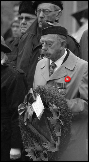
I like this photo a lot. It really brings to life the sadness that can be felt by individuals who have to endure such hardship. You can really feel this man’s pain, and you get the sense that he has really been through a lot.
Lighting:
The lighting looks just a little flat, but that could actually help here. This flatness of light give me the feeling that it was an overcast day, so even though you can’t see the sky you get the feeling that there is a dreariness there. Also, I don’t know what is going on in the lower right hand corner of the picture, it looks a little washed out.
Composition:
Nice work. You were able to get not just the main subject in there, but a couple of other glum looking guys as well just to add to the flavor. I don’t mind that the heads are cut off of the guys to the left of the main subject. What does bother me is the half-person on the far left of the pic. It really leads my eye off to the left, and I get no where to go. Otherwise, your leading lines are solid, pulling the viewer to the main points of interest.
Post Processing:
Well, everything is very smooth and clean. I like the b&w, but I really think you would have done better without the selective desat. I think that effect can be used to create a nice feel, but you just have to ask yourself, what is important about this shot? What do I want the viewer to notice first? Is it really that pin? I may be ignorant, but I don’t know the significance of that pin. It adds nothing to the emotion of the scene. I would have just left it black and white.
All that being said, this is a very nice capture, and I would hang it on my wall if I were you.
drake
|
|
 Photographer found comment helpful. Photographer found comment helpful. |
|
|
11/21/2004 08:18:14 PM |
| Congratulations on your 12th placing. A moving image filled with reverence. |
|
| Photographer found comment helpful. |
Comments Made During the Challenge  |
|
|
11/21/2004 06:59:31 PM |
| A good entry but I'd have preferred to see the hat on the left cropped out. |
|
| Photographer found comment helpful. |
|
|
11/19/2004 06:40:50 PM |
| Yet more selective desaturation with naught but the most threadbare purpose. Surely the focus of this image should be on the people - not the button? 6 |
|
| Photographer found comment helpful. |
|
|
11/19/2004 01:25:27 PM |
| Very nice touch with the red button. |
|
| Photographer found comment helpful. |
|
|
11/16/2004 10:03:54 AM |
| Good photo, the B&W captures the moment well. |
|
| Photographer found comment helpful. |
|
|
11/16/2004 08:48:55 AM |
returning for comments:
A somber capture of great sacrifice. Bumping up to 6 |
|
| Photographer found comment helpful. |
|
|
11/15/2004 04:48:40 PM |
| What a fantastic use of color. The emotion in this photo is really felt. Fantastic job! |
|
| Photographer found comment helpful. |
|
|
11/15/2004 11:58:29 AM |
| I'd rather see this just in b/w. Selective desat makes it too cheesy and populistic. This is not one of those glamour shots. Otherwise a very good image, perhaps a tad more contrast would be in order. |
|
| Photographer found comment helpful. |
|
|
11/15/2004 05:57:08 AM |
| Nice photo but IMO I don’t like the desaturation it pulls my attention to the red when I believe the mans expression says more in this photograph.. |
|
| Photographer found comment helpful. |
|
|
11/14/2004 08:50:09 PM |
| Good pic. More effective without the desat, IMO |
|
| Photographer found comment helpful. |
|
|
11/14/2004 07:49:21 PM |
|
| Photographer found comment helpful. |
Home -
Challenges -
Community -
League -
Photos -
Cameras -
Lenses -
Learn -
Help -
Terms of Use -
Privacy -
Top ^
DPChallenge, and website content and design, Copyright © 2001-2025 Challenging Technologies, LLC.
All digital photo copyrights belong to the photographers and may not be used without permission.
Current Server Time: 04/07/2025 02:18:19 AM EDT.