| Author | Thread |
Comments Made During the Challenge  |
|
|
02/09/2003 02:48:32 PM |
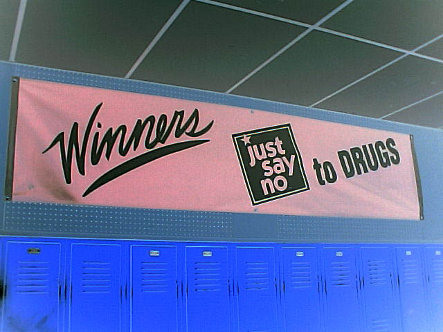
| It's an important message, but to my mind it doesn't make a particularly interesting photo. |
|
|
|
02/09/2003 01:22:07 PM |
| Just say no to storing radioactive waste in school lockers (although I understand most aren't used anymore). |
|
|
|
02/08/2003 11:45:10 AM |
Composition: Nice central subject that uses lines to draw your eye to it.
Technical: The negative seems to have made noise in the pic more obvious, especially in the pink sign.
Meets challenge: Not sure this would be a cliche in photography.
Overall impression: Ok pic but iffy regarding the challenge. 4 |
|
|
|
02/07/2003 06:27:59 PM |
| I think this could be cropped further to eliminate the ceiling..as it does not add to the photo. More impact to the sign and blue lockers without it. |
|
|
|
02/07/2003 05:11:58 PM |
| I like the lines, and I also like the negative. |
|
|
|
02/06/2003 04:24:32 PM |
| Rather boring - and I don't think this is a cliche photo - it's a photo of a cliche saying. |
|
|
|
02/06/2003 09:54:12 AM |
| good quality printing can read sign well |
|
|
|
02/06/2003 09:28:34 AM |
| I like the message in this photo. The different shades of blue are nice. |
|
|
|
02/05/2003 12:49:03 PM |
| No telling how many of those lockers have a bag of weed in them. :) Great message however! |
|
|
|
02/04/2003 06:16:34 PM |
A very captivating photo. Just want to say right off that I would like to have seen more lockers and less ceiling as I believe the ceiling is perhaps a distraction to your photo.
The pink sign with the black lettering really stands out and gives a message, but the Blue's of the lockers is really stunning and draws the eye to that part of the photo. |
|
|
|
02/04/2003 02:35:40 PM |
|
|
|
02/03/2003 09:05:43 PM |
| This is a negative enhancement, right? |
|
|
|
02/03/2003 07:45:17 PM |
| Like the theme, but not sure what I think of the photo. Do I think it meet the challenge? Yeh, but not by a lot. The lockers kind a fade into each other, and are washed out by the bottome right corner. Just think this could have been better executed. But I'm just not sure how. Sorry. |
|
|
|
02/03/2003 09:42:56 AM |
| i like the line work in this image. the line really keeps my eye moving. good job! |
|
|
|
02/03/2003 09:15:44 AM |
|
|
|
02/03/2003 08:51:21 AM |
| Good creativity, but I don't really think that this is a very 'cliche' image. |
|