| Author | Thread |
|
|
11/07/2004 07:33:02 PM |
| hey Randy: this was too much a visual for the general DPC voter, but you keep it up and you will bring them around. This was one of the most exciting entries in this challenge. Good work. |
|
|
|
11/07/2004 07:14:00 PM |
| WOW. Thanks for posting how you did this. I had no idea... great job! |
|
Comments Made During the Challenge  |
|
|
11/07/2004 02:35:27 PM |
returning for comments.
Cool guitar and cool sound.lol Bumping up. |
|
 Photographer found comment helpful. Photographer found comment helpful. |
|
|
11/07/2004 08:58:36 AM |
| Concept and execution are both great... Solid 10 from me... |
|
| Photographer found comment helpful. |
|
|
11/06/2004 07:50:04 AM |
| Can't wait to see what creative set-up you used for this. The effect you've achieved is great! :) 7 |
|
| Photographer found comment helpful. |
|
|
11/04/2004 05:14:28 AM |
|
| Photographer found comment helpful. |
|
|
11/04/2004 03:43:11 AM |
|
| Photographer found comment helpful. |
|
|
11/03/2004 06:48:02 PM |
|
| Photographer found comment helpful. |
|
|
11/02/2004 12:52:31 PM |
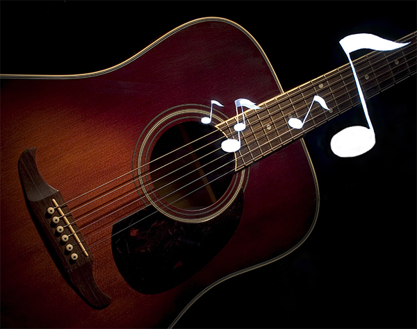
| I'm assuming the notes weren't Photoshopped in (of course), so I'm giving this a couple extra points for creativity. The two notes together (in the middle) is kind of distracting and should be separated but otherwise, very nice picture overall! |
|
| Photographer found comment helpful. |
|
|
11/02/2004 06:52:00 AM |
Nlce concept, I feel you should soften the outside edge of the notes, they would blend in better with the background...
Leroy |
|
| Photographer found comment helpful. |
|
|
11/02/2004 06:15:10 AM |
| I would have liked this better with just the guitar and no notes. Nice lighting on quitar |
|
| Photographer found comment helpful. |
|
|
11/02/2004 05:09:08 AM |
| Actually I think the notes are completely destroying a very well lit guitar. You probably got them in there somehow legaly but it seems like they're cut out in Photoshop or so. Without the notes a 6, now it's a 4, sorry. |
|
| Photographer found comment helpful. |
|
|
11/02/2004 12:01:05 AM |
| really well put together the guitar is well positioned and lit. the notes are well placed and sized maye the big one should go, the conception of the image is good I would rate this at 6 |
|
| Photographer found comment helpful. |
|
|
11/01/2004 07:59:49 AM |
| IMO the picture of the guitar itself would have been great, the white notes don´t really add anything and just become distracting but great lighting of the guitar, I probably would have given it a 10 if the white notes hadn´t been there. (8) |
|
| Photographer found comment helpful. |
Home -
Challenges -
Community -
League -
Photos -
Cameras -
Lenses -
Learn -
Help -
Terms of Use -
Privacy -
Top ^
DPChallenge, and website content and design, Copyright © 2001-2025 Challenging Technologies, LLC.
All digital photo copyrights belong to the photographers and may not be used without permission.
Current Server Time: 04/08/2025 05:05:30 AM EDT.