| Author | Thread |
|
|
01/21/2003 04:44:20 PM |
Critique Club
Hi Kandyj, wow! handheld at 1/8 shutter speed, not bad, not bad at all!
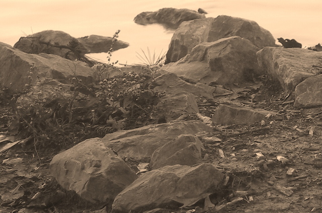
Your sepia here looks slightly pink to me, I think it kind of gives the photo an early morning look which I can't decide whether I like or not. Nice job on using your rule of thirds, and the flower, or plant sticking up in the upper left hand corner adds to the composition. I really think this was nicely composed. The foreground in the photo to me is slightly busy... besides in the upper left hand corner, on the nice calm water, I'm not sure where my eyes are supposed to be looking. The lighting looks pretty even here, and there are no drastic shadows that I can see, though there may have been in the original, hidden by the sepia. Personally I wouldn't really consider this to be a classical landscape, however it does fit the definition of landscape. The contrast in here looks rather dull, the entire picture seems to be almost the same color which is fairly bothersome, it's almost got a greyish pinkish film over the entire thing. Overall the photo leaves me wondering what the rest of the pond/lake/whatever looks like, and thinking that the ground isn't extremely interesting to me. Although I like the rocks, I think this wasn't a very exciting subject. I'd be interested in seeing more photos that you took during this outing. Good luck on your next challenges! |
|
 Photographer found comment helpful. Photographer found comment helpful. |
Comments Made During the Challenge  |
|
|
01/17/2003 01:20:11 PM |
| I like the blend of close and faraway subjects, however the colors seems off ... like a yellowed newspaper. Still a nice angle. |
|
| Photographer found comment helpful. |
|
|
01/17/2003 11:06:28 AM |
| Nice color, and nice composition. IMO, I think the photo could use some sharpening. |
|
| Photographer found comment helpful. |
|
|
01/17/2003 05:01:58 AM |
| There are not really a lot of instances where sepia works for me. This one turned out pretty well. The composition isn't terribly exciting but it's a pretty nice pic. - Inspzil |
|
| Photographer found comment helpful. |
|
|
01/16/2003 03:19:00 PM |
| the rock shots are great..I think your color choice does not do it justice...the background seems to float the farthest rock formations in air. |
|
| Photographer found comment helpful. |
|
|
01/15/2003 03:49:52 PM |
| Wonderful composition. I like the sepia tone. Maybe a little more contrast but I like it, rocks and misty water. |
|
| Photographer found comment helpful. |
|
|
01/15/2003 08:51:06 AM |
| Great use of color tones on this shot. |
|
| Photographer found comment helpful. |
|
|
01/14/2003 09:00:18 AM |
| i can't tell what i am seeing .. i assume it would be water if i could see blue |
|
| Photographer found comment helpful. |
|
|
01/13/2003 06:43:28 PM |
|
| Photographer found comment helpful. |
|
|
01/13/2003 06:23:07 PM |
| I think the coloring is distracting to me. I like the cropping and it meets the challenge. |
|
| Photographer found comment helpful. |
|
|
01/13/2003 04:05:13 PM |
| I love the tones here. This is very nice and leaves the viewer wanting to see more. Neat shot. |
|
| Photographer found comment helpful. |
|
|
01/13/2003 12:39:57 AM |
| the sepia toning does not a lot for the picture, wonder if colour would have suited it better |
|
| Photographer found comment helpful. |
|
|
01/12/2003 10:32:10 PM |
| Nide DOF ans sharpness, but I think it is lackking in contrast. Besides, I think landscape pictures usually picture a.. uh.. landscape, rather than a detail of one. Still, lovely picture (7) |
|
| Photographer found comment helpful. |
Home -
Challenges -
Community -
League -
Photos -
Cameras -
Lenses -
Learn -
Help -
Terms of Use -
Privacy -
Top ^
DPChallenge, and website content and design, Copyright © 2001-2025 Challenging Technologies, LLC.
All digital photo copyrights belong to the photographers and may not be used without permission.
Current Server Time: 04/09/2025 04:34:24 AM EDT.