| Author | Thread |
Comments Made During the Challenge  |
|
|
01/19/2003 05:33:05 PM |
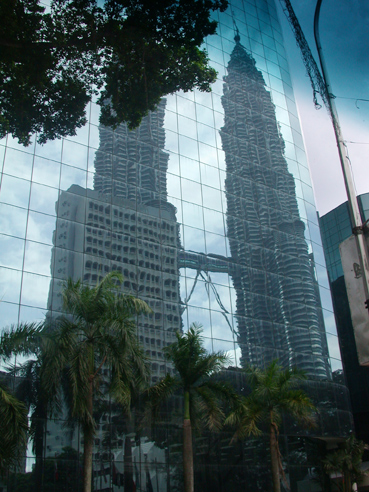
| Very nice use of reflection. 7 |
|
|
|
01/18/2003 01:17:49 PM |
| tree gets in the way a bit. |
|
|
|
01/18/2003 12:51:43 PM |
| I find the top rightmost parts of the photo distracting - a closer crop where the glass reflection fills the frame, even if some of the tower's reflection would be cut out, would make the shot a lot better. Needs to be color corrected a bit, seems a bit blue-greyish. Its a wonderful reflection though and its a good starting image! The size of these towers are always impressive! Just needs a little more work on the computer I find. |
|
|
|
01/18/2003 10:21:37 AM |
| I know that we're stretching the definition of landscape in this challenge, but this doesn't qualify for me. Setting that aside, I don't find this to be effective in composition either; the tree in the upper left and the thing (pole?) in the upper right are very distracting. |
|
|
|
01/17/2003 12:52:59 AM |
| I wonder what the shot would have looked like from on top the towers instead of the bottom for the challenge! |
|
|
|
01/16/2003 03:11:43 PM |
| It's a shame that one tower is partly hidden. |
|
|
|
01/16/2003 12:38:10 PM |
| shame theres a tree covering part of the reflection |
|
|
|
01/16/2003 11:46:41 AM |
| I think it would be better without the tree on the upper left corner... :) |
|
|
|
01/16/2003 09:17:45 AM |
| Interesting view, nice reflection. It's more city scape/architecture than landscape, but that's splitting hairs, who knows, maybe you can't get "out" of the city. Colors seem dim (crank up the saturation! esp. the green and blue) 7 Swash |
|
|
|
01/16/2003 12:40:06 AM |
| I like the idea of this picture: placing the reflection of the two towers behind some palms is wonderful. Color and sharpness are good, maybe a little brighter in the dark regions. What disturb me though are the tree branch on the upper left side and the lamppost on the very right. They frame the picture and thus it losses the open space, something very important to landscape in my opinion. Good luck. |
|
|
|
01/14/2003 06:23:52 PM |
| That is Petronas Towers for your infomation!! |
|
|
|
01/14/2003 04:47:58 PM |
| A good photo of A building, but its not even a cityscape. |
|
|
|
01/13/2003 11:25:04 PM |
| To me, it doesn't work that well. I think I would have liked to have seen the base of the trees, just to feel that everything is attatched to the landscape. |
|
|
|
01/13/2003 07:35:31 PM |
| Very nice, unfortunately, it doesn't fit the definition of "landscape" I've understood |
|
|
|
01/13/2003 01:53:43 PM |
| Wow. I guess I would of like to see the lamp post on the righ cut out, but maybe because of size??>.........anyway neat shot. |
|
|
|
01/13/2003 01:16:21 PM |
| This is an excellent photo, but I don't feel it meets the challenge description |
|
|
|
01/13/2003 05:54:52 AM |
| City scape, but albeit what the land looks like in this area. Great reflections! |
|
|
|
01/13/2003 03:17:26 AM |
| imaginative take on the towers |
|
|
|
01/13/2003 12:49:57 AM |
| more cityscape than landscape |
|
|
|
01/12/2003 08:58:19 PM |
| My guess is that this was taken from the car. The blue on the right upper corner looks like that of a windshield. It would have ruined the shot to crop it, but still it is distracting.4. |
|
Home -
Challenges -
Community -
League -
Photos -
Cameras -
Lenses -
Learn -
Help -
Terms of Use -
Privacy -
Top ^
DPChallenge, and website content and design, Copyright © 2001-2025 Challenging Technologies, LLC.
All digital photo copyrights belong to the photographers and may not be used without permission.
Current Server Time: 04/09/2025 12:07:18 PM EDT.