| Author | Thread |
|
|
01/23/2003 09:28:08 AM |
Critique Club Comment:
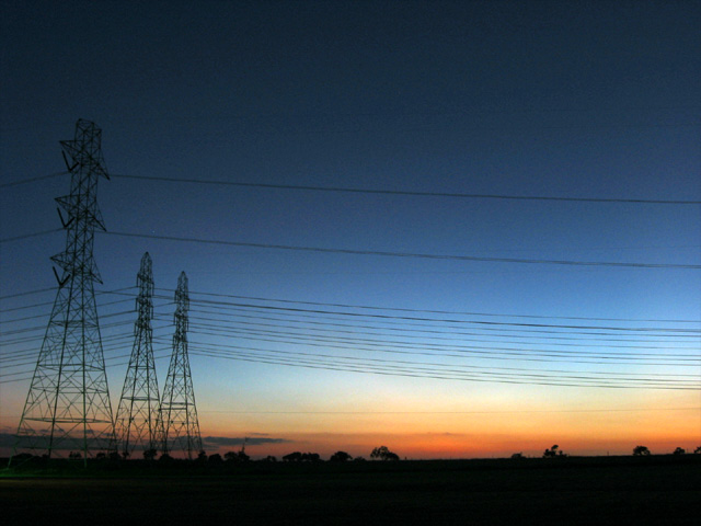
I must say that you have captured a beautiful sunset. The gradient from the warm hue of the deep orange to the dark coolness of the sky above, is soft enough to not be harsh on the viewers eyes, but strong enough to make us stand in wonderment of the beauty all around us. You have manage to take the strength of the powerline towers and make them bring strength to the sunset. The wires in parallel with the ground and gradient changes have a natural affect of pulling my eyes to the righ to enjoy the background of trees that dot the horizon.
Your use of a long shutter speed has allowed you to capture the balance of light and dark in the scene. It has also given the camera a chance to get nice sharp edges to the towers. Your horizon is level and post processing work is good. You may want to run it through an unsharp mask to really make your edges super crisp.
This is a good shot making me realize that we are just pawns placed here to enjoy sunsets like this.
-danny |
|
 Photographer found comment helpful. Photographer found comment helpful. |
Comments Made During the Challenge  |
|
|
01/19/2003 03:11:23 PM |
| I'm not too fond of the powerlines, but the sunset is very pretty. I like the colors, and this silhouettes are good. Focus looks good. Angle and framing/cropping are alright as well. The powerlines look like they are tilting. Could just be an illusion or something, but I think that's why they bother me a bit. Nice view. Good luck in the challenge. |
|
| Photographer found comment helpful. |
|
|
01/19/2003 11:34:19 AM |
| I like how you've expanded the challenge here. Very nice gradiation in the sky and you've captured it well. Nice work. |
|
| Photographer found comment helpful. |
|
|
01/17/2003 02:06:56 PM |
| The sunset is beautiful, not too sure if I like the focal point. I maybe would have tried to catch a shot of the bottom black horizon and the tops of the few trees that you can see, up to where the sky got dark blue, for stronger contrast without the distraction of the towers.. |
|
| Photographer found comment helpful. |
|
|
01/17/2003 08:50:51 AM |
| Ok, I don't like power lines on landscape pictures (with a certain exceptions) but yours are essential to this beautiful scene, I must change my vote.. |
|
| Photographer found comment helpful. |
|
|
01/17/2003 12:46:03 AM |
| Who would have thought that electric towers could look so graceful. Very nice job. I like the color and composition. |
|
| Photographer found comment helpful. |
|
|
01/16/2003 07:31:38 PM |
| One of the very few photographs that I have seen where power lines actually ADD to the shot. The towers anchor it on the right, and the lines lead the eyes to the right. Nicely done, and great colors, too. |
|
| Photographer found comment helpful. |
|
|
01/16/2003 12:41:29 PM |
|
|
|
01/15/2003 03:06:48 PM |
| Interesting......well done. |
|
|
|
01/14/2003 05:04:11 PM |
| Interesting contrast between natural beauty and man. Lovely colors. Could stand a tad more exposure or light. |
|
| Photographer found comment helpful. |
|
|
01/14/2003 02:56:49 AM |
| The sky is beautiful, but I dislike the power lines |
|
|
|
01/14/2003 12:35:44 AM |
| Sweeeeet. The power lines give it soo much more depth. 8. |
|
|
|
01/13/2003 04:13:13 PM |
| very differnet, beautiful clolours, too. |
|
|
|
01/13/2003 12:18:41 AM |
| Not much land in this one, but gorgous capture of colours |
|
Home -
Challenges -
Community -
League -
Photos -
Cameras -
Lenses -
Learn -
Help -
Terms of Use -
Privacy -
Top ^
DPChallenge, and website content and design, Copyright © 2001-2025 Challenging Technologies, LLC.
All digital photo copyrights belong to the photographers and may not be used without permission.
Current Server Time: 04/07/2025 12:45:08 PM EDT.