| Author | Thread |
|
|
01/14/2003 05:22:01 AM |
CRITIQUE CLUB REVIEW
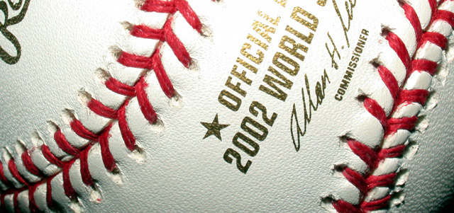
I'm struck by how good the image quality is on this picture. The color balance and sharpness are very good. Your really did a good job in bringing out the texture of the leather.
The macro works well on this image. It fills the frame and avoids any extraneous clutter.
I like the light highlight on the letters but I think that might have been toned down a shade. Maybe the letters could be a little lower in the frame to show more of the words.
Overall, a fine effort. |
|
 Photographer found comment helpful. Photographer found comment helpful. |
Comments Made During the Challenge  |
|
|
01/11/2003 03:38:01 PM |
| Great song to interpret. I really like this shot, however I find the glare on the gold letters a distracting. Still a great shot. Jacko 8 |
|
| Photographer found comment helpful. |
|
|
01/10/2003 02:41:51 PM |
| wonderful detail. I am just wondering why you cropped so much out. I think that had you left it a little taller it would have been better. |
|
| Photographer found comment helpful. |
|
|
01/09/2003 06:53:57 PM |
| A nice piece of art. The light is just a tad harsh, but I love the shot = 9 |
|
| Photographer found comment helpful. |
|
|
01/09/2003 03:57:40 PM |
| great idea, nice framing, great image even with the glare in the top middle. |
|
| Photographer found comment helpful. |
|
|
01/08/2003 10:08:50 AM |
|
| Photographer found comment helpful. |
|
|
01/07/2003 08:54:57 PM |
Great idea! I am not sure if I would have liked to see more of the ball or not. For sure I can tell it is a base ball, but would more of the ball add any. I don't know. 6.
Take my comments for what they are worth for I am just a novice with a new camera. Dodo |
|
| Photographer found comment helpful. |
|
|
01/07/2003 07:09:51 AM |
|
| Photographer found comment helpful. |
|
|
01/06/2003 06:31:36 PM |
|
| Photographer found comment helpful. |
|
|
01/06/2003 05:43:42 PM |
| Cool macro of a baseball. The light is a tad too bright on the word "official." Good job. |
|
| Photographer found comment helpful. |
|
|
01/06/2003 05:40:00 PM |
| great! composition, framing, and colors.. top and middle a bit overexposed. would like to see the lighting more even.. nice choice of subject |
|
| Photographer found comment helpful. |
|
|
01/06/2003 03:37:18 PM |
| I think this would have worked if the text was horizontal. But mabey you tried it and it did'nt work. In any case nice shot. |
|
| Photographer found comment helpful. |
|
|
01/06/2003 07:51:40 AM |
| good angle! writing on the baseball distracts me. probably better off with just the white ball and red stitches. |
|
| Photographer found comment helpful. |
|
|
01/06/2003 06:07:19 AM |
|
| Photographer found comment helpful. |
|
|
01/06/2003 05:56:45 AM |
| Major league washout at the top of this one. I'd have included more of the words, even though we know what they are. - Inspzil |
|
| Photographer found comment helpful. |
Home -
Challenges -
Community -
League -
Photos -
Cameras -
Lenses -
Learn -
Help -
Terms of Use -
Privacy -
Top ^
DPChallenge, and website content and design, Copyright © 2001-2025 Challenging Technologies, LLC.
All digital photo copyrights belong to the photographers and may not be used without permission.
Current Server Time: 04/07/2025 12:52:00 PM EDT.