| Author | Thread |
|
|
01/15/2003 03:37:22 PM |
Greetings from the Critique Club :)
and Greetings from Hickory, NC as well :)
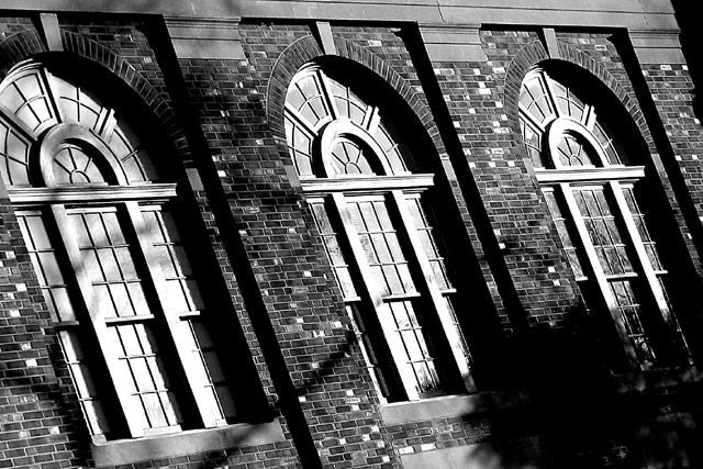
I'm glad I got this particular image for critique because I really liked it in the challenge. I'm not familiar with the song, but I really like this as a black and white image. The contrast that is present in this image is very strong, and I think that is part of what creates a great black and white image. This image represents a great variety in tones all throughou the range from black to white.
Subjectively, i like this image as well. I always appreciate architecture, and since I naturally gravitate towards black and white, this is like an extra serving of dessert for me :)
The only improvement i could suggest, as i mentioned in my original comment, woudl be to level up the top of the image some.
Keep up the great work :)
John Setzler
|
|
Comments Made During the Challenge  |
|
|
01/12/2003 07:28:57 AM |
| Definately 3 windows here. I like the use of black and white. and the angle is good. I'm glad it wasn't taken at a direct angle. The dark blob (tree, or shadow of a tree??) is a tad distracting and cuts into that second window, but your focus and clarity are great. Nice shot. Good luck in the challenge. |
|
|
|
01/10/2003 11:48:57 AM |
| The angle seems odd somehow. I think I'd like to see it dead on. Nice tones. Jacko 7 |
|
|
|
01/10/2003 06:45:07 AM |
| phenomenal b/w image... only think i would have done differently would have been to try to line up the top of the image a little closer... still a 10 - setzler |
|
|
|
01/09/2003 04:10:24 PM |
| This is a beautiful B&W, very clear and well focused. I like the cropping. My only thing is the angle. Did you mean to make it look like the whole building is leaning backwards and to the left side? Other than that I like it. 6 |
|
|
|
01/07/2003 05:42:33 AM |
| Very effective b&w, I especially like the blown out highlights in the windows, creates good contrast. Nice brick textures. I find the angled composition very pleasing but keep noticing the lines on the top aren't parallel with the frame (should be angled a couple more degrees clockwise). The large dark shadow in thr lower right also distracts a little. |
|
|
|
01/07/2003 03:01:33 AM |
| I love the angle, the contrast, the whole pic. Good job! |
|
|
|
01/06/2003 07:20:51 PM |
| Is this a song? Nice photo. |
|
|
|
01/06/2003 01:08:45 PM |
| ashamed to admit i've never heard of a song called 3 windows. which is a lot cooler than picking a song everybody knows. people are going to tell you they'd like it better held straight but don't believe them, they're myopic. you aimed at the right spot to keep the lines crisp and avoid the direct sunlight blowing everything up. |
|
|
|
01/06/2003 12:42:13 PM |
|
|
|
01/06/2003 11:25:00 AM |
This is a song?
Who sings? |
|
|
|
01/06/2003 07:19:39 AM |
| Nice picture, good lighting. Not so sure about the tilt of the picture, especially the top border conflicting with the crop. I think I would have cropped that section out. |
|
Home -
Challenges -
Community -
League -
Photos -
Cameras -
Lenses -
Learn -
Help -
Terms of Use -
Privacy -
Top ^
DPChallenge, and website content and design, Copyright © 2001-2025 Challenging Technologies, LLC.
All digital photo copyrights belong to the photographers and may not be used without permission.
Current Server Time: 04/06/2025 10:39:17 PM EDT.