| Author | Thread |
|
|
04/29/2002 03:42:00 AM |
| Very nice shot. I know the transition was hard for many to see and probably resulted in the lower score but the image is very nice. Well done! |
|
Comments Made During the Challenge  |
|
|
04/28/2002 02:16:00 PM |
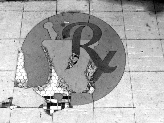
| now this is pretty cool, it's almost like the floor is a battle-weary cyborg. :) and you actually lined up the tiles with the camera! |
|
|
|
04/28/2002 07:39:00 AM |
| I think the off-centeredness of this photo is distracting -- maybe a better crop or better framing. |
|
|
|
04/27/2002 06:27:00 AM |
| black n white serves this shot well, I think |
|
|
|
04/27/2002 04:08:00 AM |
| i like this because it feels like time transition, a long kind of sad road it is really beautiful |
|
|
|
04/24/2002 10:14:00 AM |
| I keep comng back to this image. I like this more and more each time I see it. That darkenss in the upper right kind of hurts the shot though. Still, a great photo. |
|
|
|
04/24/2002 04:13:00 AM |
| I just upgraded this to a 10. I love shots like this. The look of the past is creeping through. Good shot. |
|
|
|
04/23/2002 04:12:00 PM |
| love this shot. Wish there was just a little more coontrast, and the shadow in the upper right corner was gone. |
|
|
|
04/23/2002 03:48:00 PM |
| I really like this. I presume also this is an entry to something. |
|
|
|
04/23/2002 11:51:00 AM |
| I don't understand the meaning at all. |
|
|
|
04/23/2002 06:12:00 AM |
|
|
|
04/23/2002 04:12:00 AM |
|
|
|
04/22/2002 04:34:00 PM |
| seems like a reverse transition...interesting |
|
|
|
04/22/2002 03:33:00 PM |
| This photograph definitely has my interest... *I* love black and whites personally. "Deterioration" is a transition that is very unique in this challenge. The cigarette butt adds a lot of nice impact to your entry! Good job! |
|
|
|
04/22/2002 10:31:00 AM |
|
|
|
04/22/2002 09:32:00 AM |
| Really caught my eye. do you have a colored version of this. For some reason I really want to see colors here more than the black and white. But a nice photo nonethe less |
|
|
|
04/22/2002 09:26:00 AM |
| transition is evident, but not very interesting i'm afraid |
|
|
|
04/22/2002 09:14:00 AM |
|
|
|
04/22/2002 08:39:00 AM |
| from the old to the new? I'm guessing.. but I like it though anyway. |
|
|
|
04/22/2002 06:52:00 AM |
| Good subject, I would have liked it centerred |
|
|
|
04/22/2002 06:16:00 AM |
| good b&w shot, but I don't see the transition, other than damaged to good repair. Blacks aren't black enough and whites aren't white enough for me, maybe some photoshop levels adjustments needed ? |
|
|
|
04/22/2002 05:41:00 AM |
| Cool shot, though I'm really struggling to see any sort of transition. I think the circle should be centered as well. |
|
|
|
04/22/2002 04:18:00 AM |
| your ex what? like the effects |
|
|
|
04/22/2002 04:04:00 AM |
|
|
|
04/22/2002 03:25:00 AM |
| I get this! I love the starkness you achieved with Black and White. |
|
|
|
04/25/2002 09:37:00 AM |
| I can't make out whether the logo was painted on top, and that its worn off, or if there are actual pieces missing - no sense of depth. Good transition tho. |
|
|
|
04/21/2002 08:35:00 PM |
| I fail to see the transition. Sorry. |
|
Home -
Challenges -
Community -
League -
Photos -
Cameras -
Lenses -
Learn -
Help -
Terms of Use -
Privacy -
Top ^
DPChallenge, and website content and design, Copyright © 2001-2025 Challenging Technologies, LLC.
All digital photo copyrights belong to the photographers and may not be used without permission.
Current Server Time: 04/07/2025 02:22:31 PM EDT.