| Image |
Comment |
| 01/22/2010 07:59:55 AM |
Rotundaby GeorgeComment: An interesting building, and the use of the curved wall and road leading to it is good composition. However, the tree in front of the building though is a major distraction and does not add to the image...... |
 Photographer found comment helpful. Photographer found comment helpful. |
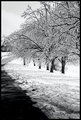
| 01/22/2010 07:57:45 AM |
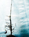
The Ice Storm, Dangerous but Beautifulby O'HolleranComment: An interesting image and great contrast between the snow and the trees and road. However, the road being cut off does prove a little awkward. Prehaps keeping the sweeping road as an element in the image, and using a square crop could have turned the road from a distraction to a string element leading through the image, and the square crop would have made the image stand out from the pack |
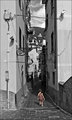
| 01/22/2010 07:52:30 AM |
a l o n eby nivlekComment: An interesting location, but there are a lot of elements and distractions to grab the eye. The black and white contrasting against the slight red of the dress does help draw the attention to the girl in the image, however she does seem a little small in the image.........it does help emphasis her alone status though......The very tall crop though I dont think really was needed, as plenty of dead space and distracting elements could have been removed at the upper part of the image with a more conventional crop ratio |
| Photographer found comment helpful. |
| 01/22/2010 07:46:02 AM |
Old Worldby myceliumComment: The image is centred, but not quite. By this I mean you have taken from the middle of the room, and the end of the room is almost in the middle of the image, as are the middle of the roof elements, but it isn't quite, which makes the image look tilted slightly. A more dramatic angle and using the brialliant elements of the room to lead the eyes through the image would have worked better. |
| Photographer found comment helpful. |
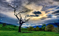
| 01/22/2010 07:43:33 AM |
Burnt Tree Revisitedby vladoComment: A great return to this tree Vlado...........Great composition and a great sky in the image.......The green grass is just a touch overdone on my monitor which might hurt the scores in a very strong field here. other than that, a great image and glad you went with this one.........not voting on it though!! |
| Photographer found comment helpful. |
| 01/21/2010 09:12:37 AM |
Visit to Gellibrand Hillby vladoComment: A great image of the family before it expanded again. Use of the yellow tones gives it an old style photo feel. Not sure Stefan is really that happy with you though..........but the kids are getting big...........
|
| Photographer found comment helpful. |
| 01/20/2010 12:25:37 PM |
Rainmanby RetroesqueComment: The Waterwall.........I miss Melbourne. I remeber as a kid playing with the waterwall, and complaining when they were thinking of not keeping it when they renovated the NGV.
Like the use of the security guard, and the placement in the bottom corner I feel works. It is a shame that you could not get it without the people in the upper part of the image. Haveing the blank negative space would have produced a stronger image. |
| Photographer found comment helpful. |
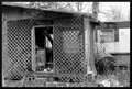
| 12/21/2009 12:39:04 PM |
Watch Your Stepby picklenoseComment: The composition of this is a little messy, nothing really grabs the eye as the subject..........The B&W does not really work for me here....and the crop is very tight |
| Photographer found comment helpful. |
| 12/21/2009 12:37:15 PM |
|
| Photographer found comment helpful. |
| 12/21/2009 12:36:49 PM |
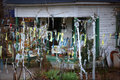
Bubba's Holiday Decorby npaselComment: Tight crop, multiple elements all trying to get attention....Composition really needed further work to make this image |
| Photographer found comment helpful. |
Home -
Challenges -
Community -
League -
Photos -
Cameras -
Lenses -
Learn -
Help -
Terms of Use -
Privacy -
Top ^
DPChallenge, and website content and design, Copyright © 2001-2025 Challenging Technologies, LLC.
All digital photo copyrights belong to the photographers and may not be used without permission.
Current Server Time: 04/13/2025 03:10:08 AM EDT.