| Image |
Comment |
| 01/24/2010 09:58:17 AM |
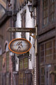
Signboardby hajekaComment: The deoth of field is not right, as the sign has gone soft on its edge.......The wires across the sign also are an annoyance |
 Photographer found comment helpful. Photographer found comment helpful. |
| 01/24/2010 09:57:30 AM |
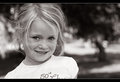
Little Poserby K3MasterComment: The depth of field here used is good to isolate her from the background. The use of grey in the border is instantly obvious and does not work for me. A white line would have been so much better. The dropped shoulder annoys me as well, as does a few of the hairs across her face |
| Photographer found comment helpful. |
| 01/24/2010 09:55:36 AM |
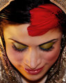
Sumptuousby AllenPComment: The composition of this image, being so closely cropped and intentionally centred, makes me look for imperfections rather than enjoying the image. Thus is does not visually appeal to me. I dont like the shallow depth of field causing progressive softness through the image either |
| 01/24/2010 09:53:52 AM |
The Lessonby jhomrighausComment: A nice image of teacher and studet. The whites are just a little overexposed, obvious in the piano keys, but also in the bright areas of his shirt. The frame running through the boys head isnt good placement, and there appears to be some colour noise evident in the background |
| 01/24/2010 09:47:39 AM |
24 Hours Cooked Suckling Pigby macobeeComment: Greta depth of field used. You are making me feel hungry.....The reflection on the spoon though grabs my attention as it is a bit overdone....... |
| Photographer found comment helpful. |
| 01/24/2010 09:46:38 AM |
Exit Stage Rightby wetlandComment: The blur in the background seems fake and overdone, and creates a distraction that draws attention away from the subject |
| Photographer found comment helpful. |
| 01/24/2010 09:45:50 AM |
Entryby BastaComment: Very symmetric and static. The title could have been used to provide more of a statement to what/why you submitted this as it seems you were trying to make a statement.... |
| Photographer found comment helpful. |
| 01/24/2010 09:44:24 AM |
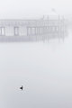
The fogby TammsterComment: Interesting. The bird int he water is needed to give depth. The fog might be just a little bit too much. The reflections though in the water are very interesting |
| Photographer found comment helpful. |
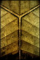
| 01/24/2010 09:42:36 AM |
Backboneby GabrielComment: An interesting geometrical image. The texture of the wood does make it a little more interesting. |
| Photographer found comment helpful. |
| 01/24/2010 09:41:59 AM |
The Promiseby Five_SeatComment: The lighting here seems a little harsh. The white from his shirt upsets the flow of the image a bit too, as does the shin off his suit button, and the blur in thee bottom right is a distraction |
| Photographer found comment helpful. |
Home -
Challenges -
Community -
League -
Photos -
Cameras -
Lenses -
Learn -
Help -
Terms of Use -
Privacy -
Top ^
DPChallenge, and website content and design, Copyright © 2001-2025 Challenging Technologies, LLC.
All digital photo copyrights belong to the photographers and may not be used without permission.
Current Server Time: 04/12/2025 11:12:43 AM EDT.