| Image |
Comment |
| 01/05/2004 08:57:55 AM |
|
 Photographer found comment helpful. Photographer found comment helpful. |
| 01/01/2004 07:18:10 AM |
Illusionby Spanish_GreaseComment: I recognise this -- its a parody of a shot by John Freeman in a book he reacently wrote. You should have taken more care lining up the glasses and kept them away from the edge of the table. You even seem to have copied the black card on either side of the glasses. No originality unfortunately, and only a moderate reproduction.
Sharp, nice colors (Like the original) and not too much noise. Had I not seen it before and apart from the lack of care lining up the glasses you would have got 7 or 8. I do however hate copies so sorry but 5.
My appologies if you had not seen mr. Freemans picture.
Edit: --
in retrospect it has occurred to me that many people do well on the site with parody photographs. Therefore my initial opinion was a little bit harsh, and I have changed your vote to a six.
I have also check again on the original that I saw, and it had a white background so I do quite like your blue background as it complements the glasses quite well. The top of your front most glasses also has a slightly uneven edge at the top of it, and this does draw your eye towards it -- which is a little bit distracting.
In order to line the classes up better I would recommend using two rulers on the bases of the glasses so that you can guarantee that they are straight.
Overall a very good picture. |
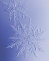
| 12/28/2003 10:22:22 AM |
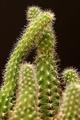
Nature's Treasureby moodvilleComment: Interesting picture, very shallow depth of field and almost a complete lack of noise. I also like a way that the border draws your eye towards the dark parts of the image, therefore providing greater contrast to the blue in the image.
I personally think that the depth of field should either have be used to concentrat on just one particular part of the image, or that you should have used a greater depth of field to show off the shape that you have in this particular picture. The shape is not really borne out by the fact that it is a bit blurred.
Also by using a very shallow depth of field, but not concentrating on just one particular element, you have ended up with a picture where you effectively have three parts in focus which are on a diagonal from bottom left to top right. This leaves the opposing diagonal somewhat empty and devoid of focus. Maybe it is this that seems to unbalanced this particular image.
As it stands there is something that I don't quite like about the image, but it is very good nonetheless. You have also achieved very crisp focus, which is obviously a benefit in a macro. Good luck. |
| Photographer found comment helpful. |
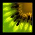
| 12/28/2003 10:13:51 AM |
Kiwi Sunshineby puyaComment: I had the idea of doing shot like this, and have been wanting to do one for a while. It was ashamed that I did not have a Kiwi fruits of the last day of the challenge which is when I took my picture.
I like your composition, and the way that the outer parts of the Kiwi fruit and the seeds take a ride towards the middle. Personally I would have run the picture through Neatimage in order to get rid of some of the noise, and I would have used a slightly small border.
Overall a good shot, good luck in the challenge. |
| Photographer found comment helpful. |
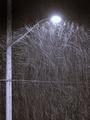
| 12/23/2003 11:19:50 AM |
|
| Photographer found comment helpful. |
| 12/23/2003 11:06:07 AM |
Sticky Situationby TerryGeeComment: Very good, good capture of detail and nice focus. I would have preferred to see slightly more depth of field so that both the main branch and the branch on the very left are in focus all the way up to the top where they meet. Good black background -- shame about the noise in it.
I recommend that you run the picture through Neatimage, and then mask the background and use Neatimage only on the background in this picture. This way you will retain full detail in the flower, but remove the noise from the background.
Good picture, nice execution good luck in the challenge. |
| 12/23/2003 11:01:56 AM |
rain drops.........it must be rain drops!!by seabrookComment: Interesting shot, I've wanted to do one like this for a while -- but I could never think up a good subject.
I'm not convinced by the shade of blue that you've used, and I also think that you could have used more of the main subjects in focus. Good focus and good depth of field. Good composition apart from like I mentioned before that I would have preferred to see more of the in focus subject. |
| Photographer found comment helpful. |
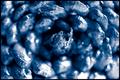
| 12/23/2003 10:56:48 AM |
|
| Photographer found comment helpful. |
| 12/23/2003 10:55:41 AM |
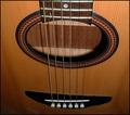
Macro Musicby JeileenComment: Very nice idea, shame that it is not really a macro. Also your picture could really do with being straightened up, try rotating it about a degree anticlockwise.
Nice and different, good colours. Good luck. |
| 12/23/2003 10:51:29 AM |
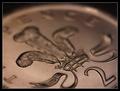
Copperby PaulMdxComment: Nice composition. Good focus. Nice DOF. Nice lighting. I like the colourisation, nice editing. Excellent contrast too. Well done.Good luck. |
| Photographer found comment helpful. |
Home -
Challenges -
Community -
League -
Photos -
Cameras -
Lenses -
Learn -
Help -
Terms of Use -
Privacy -
Top ^
DPChallenge, and website content and design, Copyright © 2001-2025 Challenging Technologies, LLC.
All digital photo copyrights belong to the photographers and may not be used without permission.
Current Server Time: 04/11/2025 12:06:23 AM EDT.