| Image |
Comment |
| 06/26/2009 03:19:11 PM |
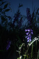
I. Hate. Cow. Vetch. by skennonComment: A bit strange photo? Besides from that the main subject (flower) is not in focus, the unnatural lightsource, coming from beneath (to harsch), doesnt make it easier to understand either. |
| 06/26/2009 03:14:14 PM |
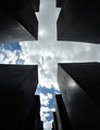
so many deathsby ralphComment: Well done! I like the angle and the transitions of the dark and lighter color tones. I also like the "invisible" cross appearing out of the heaven and the stones. The title "From the Ground Up" would really suit this image as well! |
| 06/26/2009 03:08:17 PM |
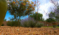
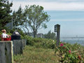
Backyard from a Lizards’ Perspectiveby rajronComment: As a viewer, I cant see that any of the flowers, plants or the pots stand out in any way. This results in that the "visual message" of the image is that there is simply nothing specific or interesting going on in this image - and therefore it doesnt catch my interest. |
| 06/26/2009 02:57:24 PM |
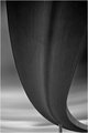
Right Curve by JohannesFrankComment: Wow! Besides the well placed "curve", I really like the sort of "dreamish" background. |
 Photographer found comment helpful. Photographer found comment helpful. |
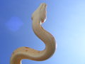
| 06/26/2009 02:56:14 PM |
I Believe I Can Flyby FallenDemonComment: Very nice color tones and interesting shape of the snake. Its a real pitty though that there is an obvious spot/pattern on the left side of the snake. I would try to remove that with photoshop (but obviously not with this photo, as "basic aditing rules apply" ;-) |
| 06/26/2009 02:52:32 PM |
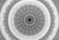
Star and Lightby kenna718Comment: He he, this really makes you wonder what you are actually looking at! Interesting! |
| Photographer found comment helpful. |
| 06/26/2009 02:50:42 PM |
|
| Photographer found comment helpful. |
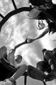
| 06/26/2009 02:46:05 PM |
Pop Talkby m3snowComment: I really like the angle! I also like the lines and patterns from the boy´s hands and from the circular stand they are sitting on. However, I would have tried to simplify the "composition" if possible - to make the most important things stand out clearer. For example I think that this image could benefit from only having the two boys, instead of three (the ones reaching out). The "third" kid makes the composition less symmetrical, and you dont see his face either, making him less interesting. I think I would also only use one can (the one in the middle) - making the picture imply that there is an act of kindness taking place.
But if course this is just my personal opinion, and in the end, it all depends on what "message" you want the image to deliver. |
| 06/26/2009 02:31:04 PM |
untitledby whiterookComment: As a viewer, I cant see any obvious motive in this image. What are you trying to "express" in this picture? |
| Photographer found comment helpful. |
| 06/26/2009 02:29:11 PM |
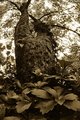
Dogwoodby tvsometimeComment: Big and a impressive tree. However, I would crop out just a little bit of the plants/leaves at the bottom of the picture - as the lower part of them seems to be bit more blurry than the top half. Besides that, having the plants take up so much space takes the viewers attention from the main-subject, which is the tree. |
| Photographer found comment helpful. |
Home -
Challenges -
Community -
League -
Photos -
Cameras -
Lenses -
Learn -
Help -
Terms of Use -
Privacy -
Top ^
DPChallenge, and website content and design, Copyright © 2001-2025 Challenging Technologies, LLC.
All digital photo copyrights belong to the photographers and may not be used without permission.
Current Server Time: 04/11/2025 05:00:32 PM EDT.