|
|
| Image |
Comment |
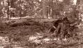
| 09/20/2005 08:34:35 AM | A beautiful end...by rocklova72Comment: Greetings from the Critique Club
The signs of decay in nature can be a good source for photography. Stumps, fallen trees, forest growth, ground cover all work to make interest in a photo. It is good that you are able to recognize that your photography can grow. Do not let these results detract you from continuing your quest.
Let me give you a few suggestions that may help your photo.
1. Color/Tonal Range: The coloration may add to a photo in post-processing, but what has happened here is that it has made everything blend into itself and there are no real distinction between your subject (the fallen tree) and the background/surroundings. A real black and white conversion with more contrast would help.
2. Picture Size: Hard to make out the details in small pictures, and when you make them smaller than what they can be makes it even harder to see and judge the details in the photo. The width of this image is 498 pixels, when the maximum allowed is 640 pixels.
3. Lighting: Now it is an outside picture, am I supposed to bring out the lights and reflectors, etc... No. With this picture, being fairly wide, and in the shade, the splotches of light shining through the canopy give it a mottled feel. A tighter picture, getting rid of most of the splotchy lighting may help.
Overall Impression: This is a tough thing to take a picture of. There are possibilities here, but I think you need to ask yourself what is the focus of this picture? How can I show that focus the best and minimize any distractions to it at the same time? Most of the time, especially here on DPChallenge, the best pics go for simplicity. Too much going on in the picture and you get hurt in the voting. Walk in, and focus in on the stump, get it to shine and the picture would do better.
Keep trying, like you said in your profile, it is all a learning experience. Good luck in future challenges.
If you have any questions on this critique, feel free to PM me. |
| 09/20/2005 07:46:59 AM | Red Veinsby nemesise1977Comment: Greetings from the Critique Club
First impressions on this give me a sense of wonder. The reflection of the rose petal with the mirror gives it a sense of being a clam shell.
I noticed that you used an aperture of 4.3 on this. This gives a shallow depth of field. This is good to make the focus fade out as it goes back. When you use this, you need to make sure that you have the DOF exactly where you want it to be. Unfortunately I think that it is a bit shallow, as the reflection in the mirror lies outside the focus.
In reading your description, I can see that you went through some work to get the petal to have some red coloring. Unfortunately it ended up looking like it had the mumps. A much tighter crop or zoom in more to focus on just a section of the petal may help to show the veins that you were wanting to highlight.
The picture itself seems like it needs a little anti-clockwise rotation to help level it.
Probably what hurt the most for this is that this challenge was asking for a "Branch" and what we see in this photo is only a petal of a flower. This is a bit of a stretch for most voters on DPChallenge, and it shows in the score that you received.
Don't give up, keep shooting, you will see your score improve as you do it more and more.
Overall Impression: I have to agree with the voters, in that this would be either a 3 or a 4 on my own voting scale. A tighter crop and a little more DOF may bump it up to a 5.
If you have any questions on this critique, feel free to PM me. |
| 09/20/2005 06:49:31 AM | Innocenceby JudiComment: Greetings from the Critique Club
This is a good portrait. In every portrait, the eyes are the most important aspect. Here her eyes draw us into the photo as we ask ourselves what thoughts and emotions lie behind them. I think the strength of her eyes alone make this photo rise above the 6 mark in the voting.
Possible (stress on possible) suggestions for improvement:
1. Hot Spots/Highlights: This was an advanced challenge, so you could easily clone out the 2 hot spots on the tip of her nose (kind of like a second set of nostrils). I would also at the same time remove/fix the highlights in her right eye (only want one). At the same time, you might see if you could fix what seems to be the beginnings of a spit bubble at the corner of her mouth.
2. Crop: This also deals with the use of the scarf to frame the person. There is a certain formulaic use of the scarf (especially recently on DPC) which works. In this instance, I think you didn't realize the full potential of it because of the tightness of the crop. The scarf needs a little more room around it to really effectively frame the face. As it is, especially on the left side, it is just some red cloth.
3. Lighting: I do think a little more in the way of diffuse lighting would help, maybe a reflector to reflect some white light back up into her face would help as well. This would really help the right side of her face where the shadows have a reddish tint to them from the cloth.
Overall Impression: I do agree with the voters, this would have been a 6 for me had I voted, with the catchlights/highlights fixed may have bumped up to a 7. I really think you did an excellent job on this portrait, and with a few quick fixes would be even better.
If you have any questions on this critique, feel free to PM me. |  Photographer found comment helpful. Photographer found comment helpful. |
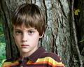
| 09/20/2005 05:49:55 AM | RYANby mandyturnerComment: Greetings from the Critique Club
This is a good portrait of your nephew. I do think you got 'him' almost exactly right. The eyes are bright and wide, focused and sharp. Skin tone is right on, with just enough softness to be smooth without plasticky feeling. Hair has great detail as well. The colors in his shirt also work well with his hair and eyes, good coordination with that.
Now to look for areas that could be improved on. Most of these have been mentioned in others comments.
1. Background/Subject: The way the photo is, there is a seeming competition between the subject (your nephew) and the background. While the boy is fantastic, the background being so sharp makes us want to look at it more than the boy. The detail in it is fascinating, including the leaf. In fact, take away the boy, and you will still have an interesting photo. This shouldn't be if this is really a color portrait.
2. Depth of Field: I think the DOF could be moved toward the camera just a little bit. This would give his chin and lips a little more sharpness to remove the sense of blurriness there. It would also blur the tree into the background a little more so it wouldn't be in as much competition with the subject.
3. Pose: Look at the line of his shoulders. Because of the way he is positioned, the shoulders slope out to the left and down. This gives the closer one a feel of being out of proportion with the rest of his body. It also leads the eyes out of the picture. A slight change in pose turning his body more toward the camera and moving him a little forward from the tree may help with this.
Overall Impression: I did not vote in this challenge, but had I voted, I would have scored this a 6. If the tree was not in such competition with the subject, would be bumped up to a 7.
If you have any questions about this critique, feel free to PM me. | | Photographer found comment helpful. |
| 09/20/2005 04:19:59 AM | Blueby SJCarterComment: Greetings from the Critique Club
On first glance, this photo really stands out. It has some very good potential. The way you used the sunglasses almost as a filter to give the eyes the normal exposure while blowing out the rest of the face is a great technique. The eyes themselves have come out very good.
In saying that however, it falls short of becoming a good photo. Here are some suggestions that may help:
1. Polarizer Filter: The eyes as I said before are fantastic, but the reflections off of the sunglasses really ruin their impact. While they should be nice and clear, both eyes suffer from something reflecting right in the middle of them. A polarizer would remove this reflection and give them added impact. It would also allow the color of the eyes to come out a little stronger.
2. Exposure: While I appreciate what you've done with this, a couple of things would help. First the lips. If you added a little lipstick (I know, you're a guy) to make them darker to start off with, they wouldn't be quite as washed out in the final. Second is the forehead portion to the top left. Most of the face is left without any details, but then the forehead in the top left produces a fairly dark (respectively speaking) section that is disjointed from the rest of the face, which produces another focal point which then detracts from the real focus of the eyes. Dodge it out or clone it out, so that it matches the rest of the 'missing' left side of the face.
3. Facial hair: I've read the comments that others have said, and I must say that I personally think the facial hair helps to give it more texture. However, it needs to have a more defined shape to the beard or a little more to fill it in. Also, it does seem to add some focus to the nasal hairs in your nostrils which is not a good thing. The hair to the left of the mouth (as we are looking at it) gives your face a little bit of a 'chipmunk' look as we have no other dimensions to the face except that little bit of facial hair.
All in all, this was a very creative take on the challenge. However, I think that this being a "Color Portrait" challenge and by removing almost all of the color from your face in the overexposure really hurt the score overall.
I did not vote in the challenge, but if I had, I would have scored this a 5. With the polarizer in place to remove the reflections, may have been bumped up to a 6.
Feel free to PM me with any questions you might have. | | Photographer found comment helpful. |
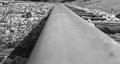
| 09/19/2005 11:35:27 PM | Northern Branch of the L & N Railroadby rayg544Comment: Greetings from the Critique Club
I must say that this is one of the most unusual perspectives for a railway shot that I have seen. I do think that unusual perspective helped keep your score above 5.
The black and white conversion is good with tonalities going through full black to full white across the picture.
A few things that would help this picture:
1. DOF choice: In a shot like this with the one STRONG line leading through the picture, it would be better to start it out tack sharp and let it then fade out as you go through the picture. The line should produce the dynamic movement through the picture. Here, when you look at the picture, the eye has to struggle through the out of focus at the bottom of the picture to get to the part that is sharp.
2. Focal Point: Where does the leading line lead me to? What am I supposed to be looking at in the picture? Especially in this as a black and white photo, I need something to be looking at, and not just the line (the track) leading me through the photo. This also relates to the choice of DOF, as I get to the tack sharp point and want to be able to look at something there, but nothing appears and my eye wanders right off the top of the photo without being able to stop and 'rest'.
3. Clutter/Background: You already noticed some of this as in your comments, you had cloned out the grass blade and then noticed it was basic editing. What would help in this to start off with is to just go and pull the grass from the track before you take the shot, then you don't have to worry about it. Look at the background and ask, "Is there any way I can remove distractions from the background before I take the photo?"
4. Crop: Most photos of railway tracks are done in the vertical/portrait orientation rather than horizontal. A vertical/portrait orientation gives a sense of distance of the track seeming to extend to infinity and beyond. With this orientation in the photo, there is a sense of truncation, of stiltedness. There is too much space to the left and right of the track for my eye to drift back and forth.
Overall Impression: While I did not vote in this challenge, I would have scored this picture a 4. Removing the distractions from the background would bump it up to a 5. Correcting the DOF/orientation would possible bump it up another point to 6. I do think that your conversion to B&W is very good and your eye for a different perspective is commendable as well.
If you have any questions about this critique, please feel free to contact me via the PM system. | | Photographer found comment helpful. |
| 09/19/2005 12:00:44 PM | The Woods Are Lovely, Dark and Deep...by ecdillonComment: Greetings from the Critique Club
First impression on the photo is that there is no real overall theme or focal point to the photo. You have done a good job on the exposure to get the sillhouettes to be sharp.
I do think that the colors overall do contribute to the photo. The sky is just a small section that is blown out, but it does not detract from the photo.
A couple of improvements that may help:
First is that the branches, while the theme for the challenge, do not seem to be a focal point for you to look at. Rather, they are jumbled together and generally seem to form a detraction to the eyes. The eyes are almost forced to jump around from place to place trying to find somewhere to rest and really look at for a while. Especially in sillhouette shots, there should be something that really makes me stop and look at it for a while. Simplify the composition by removing some of the trees/branches from the photo.
Second would be the crop. The trees are supposed to give me a vertical feel, they should be tall and lofty. Instead with the crop that you've given me, everything feels stumpy, short and confined, which is exactly the opposite of what trees should feel like. Also the trees seem to be leaning all to the left (except the one to the far left), so a little clockwise rotation would help to give them more of a vertical feel. If you want the crop you have here, at least remove the branches which are poking in from the right side of the photo.
Overall Impression: While I did not vote in this challenge, I would have scored this picture a 4. The sillhouette and feelings evoked by this photo give it potential, but it just needs a little more of a focal place to make it stand out.
If you have any questions about this critique, please feel free to contact me via the PM system. | | Photographer found comment helpful. |
| 09/19/2005 11:32:17 AM | After The Rainby BowerbirdComment: Greetings from the Critique Club
Contrasting the bright red color of the flower against the watery background works very well in this photo. When you can find one thing that is different from the surroundings/background it has the beginnings of a good photo.
A few things might make this composition a little better. First is the removal of the second branch from the photo. By going forward and physically moving the branch so it is not in the picture would simplify the seeming jumble of branches to the left and allow the one remaining branch to point to the flower which is the focal point of the picture.
A slightly tighter crop, sort of like this simplifies the photo, yet keeps the flower as the focal point.

I just don't think that the square crop helps the photo. Notice how the branches now all point to the flower, and don't leave me stuck on the ends when I am following them with my eyes.
The red flower is almost directly in the middle horizontal of the photo and gives the picture the 'flat' or dead look. Try to make it more dynamic by moving it either up or down to one of the third's lines.
I would also like to see a little more of the flower, turned toward me or some more detail in it.
Others have mentioned the seeming darkness of the picture and the softness in the branches/flower, so I won't repeat that even though I do think they are valid points. Maybe a slight levels adjustment in the dark areas while not touching the highlights would do the trick.
I would encourage you to increase the size of your photo that you submit, as your picture is only 501x480, where you are allowed to submit up to 640x640. The larger the picture size you enter, the more detail the voter will see (especially in the flower itself). I do think this would have bumped your score up by 2/10ths at least.
Overall Impression: While I did not vote in this challenge, I would have scored this picture a 5. Larger version of this would be a 6. Cropped it to get the flower more dynamic a 7. I do like the photo overall, and feel that it has potential, and just needs a little more to make it stand out.
If you have any questions about this critique, please feel free to contact me via the PM system.
p.s. People really appreciate when you click that their comments are helpful, so I would encourage you to do that.
| | Photographer found comment helpful. |
| 09/02/2005 10:27:18 PM | Tubaby elsapoComment: Wow, great shot, so many elements in it, but each one is an individual photo, but yet not distracting to the central theme of the tuba. Let me count the photos....
1. Tube and player
2. People on sidelines of field reflected in tuba
3. Shadows of band reflected in tuba
4. Football players playing on the field
5. Stands (wish they were a bit clearer, but can't have everything)
All working together to make the one photo of the Tuba. Interest everywhere, but with a central theme. Congrats on this one. | | Photographer found comment helpful. |
| 08/29/2005 12:25:18 PM | Panorama of Lake Ronkonkomaby TabbyCatComment: Hard to tell from this size, but looks like a great first attempt at a panoramic. Only real suggestion I would have on this one would be to clone out the metal railing on the right side, so as to have just water. | | Photographer found comment helpful. |
Home -
Challenges -
Community -
League -
Photos -
Cameras -
Lenses -
Learn -
Help -
Terms of Use -
Privacy -
Top ^
DPChallenge, and website content and design, Copyright © 2001-2025 Challenging Technologies, LLC.
All digital photo copyrights belong to the photographers and may not be used without permission.
Current Server Time: 04/11/2025 12:16:15 AM EDT.
|