| Image |
Comment |
| 03/22/2008 08:15:53 AM |
The Simple Lifeby dponlymeComment: Very nicely composed, but it looks like you have decreased the contrast too much, and the shadows look grey and muddy. IMO it needs a levels adjustment to give it a true black point, and then desaturate the reds a little to get rid of that colour cast on the skin. Cute baby! |
 Photographer found comment helpful. Photographer found comment helpful. |
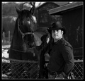
| 03/22/2008 08:04:00 AM |
The Instructor's Next Business Cardby yakatmeComment: Nice capture! I really like everything about this except that it is slightly over-saturated, and unfortunately it makes the guy look like he's wearing makeup! |
| Photographer found comment helpful. |
| 03/22/2008 08:01:51 AM |
Playing in her Gardenby LMA128Comment: Nice portrait, though for this challenge, I would have liked to see more of the environment. Something about the exposure bothers me a bit, like it is too grey and muddy-ish. Looks like you may have tried to decrease the contrast to compensate for the harsh lighting, but went a little too far. I tried doing a levels adjustment in Photoshop, and it seems that simply giving it a true white and black point made quite a difference. Makes it pop and look more natural too. |
| Photographer found comment helpful. |
| 03/22/2008 07:40:33 AM |
in the teenage environmentby smardazComment: Wow, what a nice looking bedroom! I really like this one, especially how she is illuminated by the glow of the computer, it really emphasizes the point. The only problem I see is that it slopes to the right slightly. |
| Photographer found comment helpful. |
| 03/22/2008 07:29:59 AM |
Just a Good Ol' Boy by JawnyRicoComment: Nice lookin' dude! ;-) I really like how most of the picture is darker tones. This is one of my faves. |
| Photographer found comment helpful. |
| 03/22/2008 07:18:21 AM |
Paul by wildirisComment: Interesting use of reflections, and it's great how it not only shows his environment behind him, but all around him including in front. Nice one. One thing I would suggest is to balance out the colour cast a bit. |
| Photographer found comment helpful. |
| 03/21/2008 06:41:11 PM |
Hula Girlby BumpyBComment: Great portrait! But I don't see her environment at all, so I'm afraid it doesn't really meet the challenge. |
| 03/21/2008 03:55:58 PM |
Abe.by danitelloComment: Nice portrait, though I would like to see a little more of his "environment", as the challenge calls for an environment that says something about the person. Exposure-wise, I'd like to see the shadows a bit darker to give the image more depth, and unfortunately there are some blown out highlights on the hand and the face is a little overexposed. Compositionally, I wish he was looking at the camera, instead of leading my eye out of the frame. Despite all these nit-picks, I do like the photo, and he is an interesting subject. Just needs a few technical tweaks. |
| Photographer found comment helpful. |
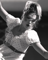
| 03/15/2008 11:13:46 AM |
Joy of Lifeby blazelleComment: Very nice photo, but I just don't see it as a "Blurry Mess". Sorry. |
| Photographer found comment helpful. |
| 03/15/2008 11:13:22 AM |
10by ladpupmoeComment: Nice photo, but I just don't see it as a "Blurry Mess". Sorry. |
Home -
Challenges -
Community -
League -
Photos -
Cameras -
Lenses -
Learn -
Help -
Terms of Use -
Privacy -
Top ^
DPChallenge, and website content and design, Copyright © 2001-2025 Challenging Technologies, LLC.
All digital photo copyrights belong to the photographers and may not be used without permission.
Current Server Time: 04/07/2025 06:14:59 AM EDT.