| Image |
Comment |
| 02/11/2008 05:32:42 AM |
White goes with anythingby scotthadlComment: Too straight on, and the top of the bag is also washed out. The background changes shades of green which adds to the picture. |
 Photographer found comment helpful. Photographer found comment helpful. |
| 02/11/2008 05:31:38 AM |
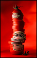
Freshly Squeezed by TechoComment: Shot is very creative, the lable looks like it is acctually part of the tomatoes. The background is interesting too as it isnt just one color, the shadows are there as well. |
| Photographer found comment helpful. |
| 02/11/2008 05:30:29 AM |
Fastest in it's classby bibuComment: The right side of the photo is wahsed out. By using a darker color background and getting farther away from your subject you can eliminate that. |
| Photographer found comment helpful. |
| 02/11/2008 05:29:47 AM |
|
| Photographer found comment helpful. |
| 02/11/2008 05:29:00 AM |
Get Ur Steep Onby HipychikComment: The eye is immedeantly drawn to the cup as the colors contrast very nicely. The picture is very sharply in focus, which helps the eye chose where to look. |
| Photographer found comment helpful. |
| 02/11/2008 05:26:55 AM |
|
| Photographer found comment helpful. |
| 02/11/2008 05:25:38 AM |
|
| 02/11/2008 05:25:25 AM |
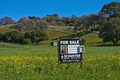
For Saleby bobgaitherComment: Too much background space. By getting closer to the subject and cropping the picture, it would have been more interesting. |
| Photographer found comment helpful. |
| 02/11/2008 05:23:32 AM |
Naturally.by stickmanmitchComment: Nice placement of the subject, its in the middle and draws the eyes immedeantly. The colors pop out of the photograph, and its simple but creative. |
| 02/11/2008 05:22:36 AM |
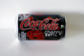
Cherry Zeroby losemeComment: Too straight on, and the shadows are all over the place. There is also a hot spot in the left corner of the can. |
| Photographer found comment helpful. |
Home -
Challenges -
Community -
League -
Photos -
Cameras -
Lenses -
Learn -
Help -
Terms of Use -
Privacy -
Top ^
DPChallenge, and website content and design, Copyright © 2001-2025 Challenging Technologies, LLC.
All digital photo copyrights belong to the photographers and may not be used without permission.
Current Server Time: 04/12/2025 09:43:17 AM EDT.