| Author | Thread |
Comments Made During the Challenge  |
|
|
02/11/2008 05:38:34 PM |
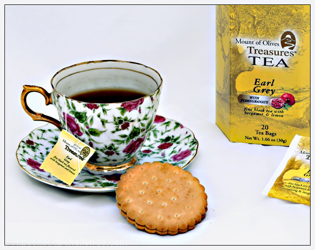
| The quality of the photo is a little poor and the colors clash, but I am somehow really attracted to this photo. |
|
 Photographer found comment helpful. Photographer found comment helpful. |
|
|
02/11/2008 04:58:09 PM |
| Beatiful work here. A near perfect ad. The cup of tea with the box makes me sure of what the product is and everything is perfectly displayed. A little more space on top for possible text a cleaning up the small crumbs under the cookie are my only small picks. I'm still giving it a 10. Good luck! |
|
| Photographer found comment helpful. |
|
|
02/11/2008 05:29:00 AM |
| The eye is immedeantly drawn to the cup as the colors contrast very nicely. The picture is very sharply in focus, which helps the eye chose where to look. |
|
| Photographer found comment helpful. |
|
|
02/10/2008 10:06:37 PM |
|
| Photographer found comment helpful. |
|
|
02/09/2008 09:10:29 PM |
| The plate looks out of focus as does the tag. |
|
| Photographer found comment helpful. |
|
|
02/07/2008 02:55:16 PM |
| definitely looks like an advert for tea... |
|
| Photographer found comment helpful. |
|
|
02/07/2008 02:24:40 PM |
| Nice image. IMO, there is a bit too much white space between the saucer and the box, and the tea bag is too far to the right. |
|
| Photographer found comment helpful. |
|
|
02/07/2008 11:35:01 AM |
| The lighting on this is very good, as is the focus. Having the tea pack and bag partly in the frame and partly out, though makes it feel off balance to me. Maybe if the cup and cracker/cookie/biscuit were also partly out of the frame in the lower left corner, it would feel more balanced (to me). |
|
| Photographer found comment helpful. |
|
|
02/07/2008 05:12:55 AM |
| The highly patterned cup, although beautiful, distracts from the product. |
|
| Photographer found comment helpful. |
|
|
02/06/2008 11:52:43 AM |
| Love the colours, and the simpleness. Something about it just appeals to me, and I don't like Earl Grey =) |
|
| Photographer found comment helpful. |
|
|
02/06/2008 10:50:29 AM |
| Has a strange, unnatural look. Not my cup of tea |
|
| Photographer found comment helpful. |
|
|
02/06/2008 05:16:46 AM |
|
| Photographer found comment helpful. |
Home -
Challenges -
Community -
League -
Photos -
Cameras -
Lenses -
Learn -
Help -
Terms of Use -
Privacy -
Top ^
DPChallenge, and website content and design, Copyright © 2001-2025 Challenging Technologies, LLC.
All digital photo copyrights belong to the photographers and may not be used without permission.
Current Server Time: 04/06/2025 11:03:20 PM EDT.