| Image |
Comment |
| 04/03/2008 07:23:22 AM |
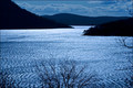
Bright Watersby HeiSchComment: this looks to contrasted, to black and white, i would have liked to see more shades of blue in the water and a brighter sky. |
 Photographer found comment helpful. Photographer found comment helpful. |
| 04/03/2008 07:22:17 AM |
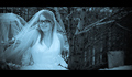
Bridal Blueby EyesupComment: Kind of reminds me a bit of corpse bride with the blue hue. I like her expression but the right side of your photo should have been cropped more it gets blurry and boring. (just half an inch i think...) i also like how her arms seem to disapear. |
| Photographer found comment helpful. |
| 04/03/2008 07:19:44 AM |
True Blueby silverscreenComment: I love this angle and building. Great distortion on the other buildings too. Everything about this seems perfect for the competition. |
| Photographer found comment helpful. |
| 04/03/2008 07:18:05 AM |
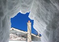
View from the Iglooby TannisComment: I do consider white to be both warm and cool depending onthe suroundings so i like what you've done here. the framing with the snow looks really cool, and the nmonotoneness (except for the chimney) looks beatiful |
| Photographer found comment helpful. |
| 04/03/2008 07:15:59 AM |
|
| Photographer found comment helpful. |
| 04/03/2008 07:14:34 AM |
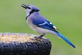
Shades of Blueby k9logicComment: The bird and bird seed really bring out the blue hue on that tire. Real nice detail and textures all through out your photo. |
| Photographer found comment helpful. |
| 04/03/2008 07:06:46 AM |
Quixotical.by SergePComment: i would like to know what this is for. I do like the subject, the gold is dark enough that it enhances the blue instead of taking it away. Those hotspots on the other hand do distract a bit, bt other than that i like it. |
| Photographer found comment helpful. |
| 04/03/2008 07:04:04 AM |
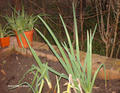
Aloe and Onionsby cnuicuComment: Too bad about the date and time down there... other than that your flash made the light too intense and it got rid of all the detail and shadow creating that cut and paste look. The colors, for me, just aren't cool enough either. |
| 04/03/2008 07:02:12 AM |
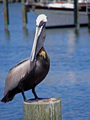
Cool Pelican, Hot Sunshineby ThatChickOverThereComment: The bright blue of the water is nice but the bird's head looks a bit bleache out, maybe you shot this in a time of day were the light was at it's most intense and then this could have been fixed with a little patience to wait for the right light. (i guess the bird would fly away though...) |
| Photographer found comment helpful. |
| 04/03/2008 06:59:04 AM |
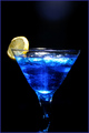
Polar Bearby bevilllComment: The glass itself looks a little dirty, maybe thats just the liquid inside. I like how you added the lemon for a complementary color, but since the photo is so dark it more draws my attention all to it instead of bring out the blue liquid. |
Home -
Challenges -
Community -
League -
Photos -
Cameras -
Lenses -
Learn -
Help -
Terms of Use -
Privacy -
Top ^
DPChallenge, and website content and design, Copyright © 2001-2025 Challenging Technologies, LLC.
All digital photo copyrights belong to the photographers and may not be used without permission.
Current Server Time: 04/16/2025 12:02:06 PM EDT.