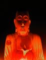
| Image |
Comment |
| 06/15/2003 09:18:12 AM |
|
 Photographer found comment helpful. Photographer found comment helpful. |
| 06/14/2003 09:27:48 AM |
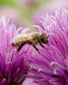
American Entomologist by connieComment: I like the lighting on this one - it makes for a very airy, ethereal effect that's so appropriate for your subject! Nice balance to the image, as well. |
| 06/14/2003 09:13:37 AM |
DISCOVER "Killer Bees"by severinComment: Very pretty - though it looks a bit like the bee is hanging in midair with its wings unspread (and therefore not flying), at this detail level. |
| Photographer found comment helpful. |
| 06/14/2003 09:12:40 AM |
Backpackerby kellymcgComment: The blue-green lighting is gorgeous, as is the silhouette effect. The placement - letting the hill/mound dominate the lower part, the subject jutting up into the light - is really nice. |
| 06/14/2003 09:11:40 AM |
Canadian Gardeningby mcraelComment: This is a nice macro shot - the detail of the flower's center, to the point of seeing the grit, and the flush of (wax? oil? liquid?) on the petals, is really nice. It's easy to see how text could be placed over the petals without damaging the image as well, when it was placed on the cover. |
| Photographer found comment helpful. |
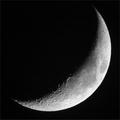
| 06/14/2003 09:10:29 AM |
Sky & Telescopeby Chilly0999Comment: Nice, nice dramatic photograph. I like the way most of the photo is black, and yet there's this awareness of weight to the upper left corner, the awareness that the moon is there, just hidden. The detail on this, and the framing of it, are both excellent. |
| Photographer found comment helpful. |
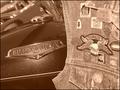
| 06/14/2003 09:07:44 AM |
American Iron Magazineby justineComment: This is a nice shot, overall, but I have trouble envisioning where magazine text would go other than in a neutral frame, if one were placed around it. The contrast between the smooth/sleek bike and the patterns and crowded feel of the patches to the right is really nice and works well, though. |
| Photographer found comment helpful. |
| 06/14/2003 09:05:46 AM |
|
| 06/14/2003 09:03:42 AM |
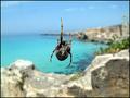
House Beautifulby giampoComment: A lovely spider - a nature-themed magazine might have been more appropriate, though, especially considering the backdrop. |
| 06/14/2003 09:03:06 AM |
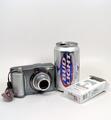
Addiction Professionalby buzzrockComment: A cute and funny concept, and well-shot, but I just don't see it on a magazine cover - it's got room for text, but I'm hard-pressed to accept that an addiction-themed magazine would actually place a camera on their cover at all. |
Home -
Challenges -
Community -
League -
Photos -
Cameras -
Lenses -
Learn -
Help -
Terms of Use -
Privacy -
Top ^
DPChallenge, and website content and design, Copyright © 2001-2025 Challenging Technologies, LLC.
All digital photo copyrights belong to the photographers and may not be used without permission.
Current Server Time: 04/13/2025 10:23:58 AM EDT.