| Image |
Comment |
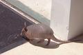
| 08/11/2003 07:52:48 PM |
Back Yard Visitorby GraciousComment: This is a neat photo; I like the way you caught it frozen mid-step. I'm not really convinced that the right angles here contribute to the strength of the photo, though they don't damage it, either. There's some graininess evident, particularly in the shadows. |
 Photographer found comment helpful. Photographer found comment helpful. |
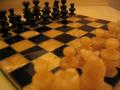
| 08/11/2003 07:50:58 PM |
The battleby chongoComment: This is a neat concept and composition for this...but the focus isn't super-crisp even on the pieces/parts of the board that are in focus, and the reflections are distracting. Did you use a tripod? Is there something that could have reduced or eliminated the reflections, maybe a bit of cloth spread above the camera's reach so that only flat cloth was reflected? |
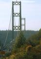
| 08/11/2003 07:49:12 PM |
Bridge Towersby GeneralEComment: A neat concept and composition. I'm not sure if it's the haze or actual lack of focus, but it doesn't seem like anything is quite in focus, which is a pity. It would be neat if the bridge pieces were in sharp focus, drawing the eye more completely to them and the involved angles. |
| Photographer found comment helpful. |
| 08/11/2003 07:48:07 PM |
Right to be a kidby GinxComment: This is a cute photo and a neat composition - but why so small? A photo for a challenge can be a lot larger, and thereby more engaging. |
| Photographer found comment helpful. |
| 08/11/2003 07:47:22 PM |
Right Anglesby observeComment: Lots of right angles, definitely! The way the details are partly lost on the most brightly-illuminated is distracting, though, and I'm not quite sure what the "draw" of the photo is meant to be, or where to rest my attention. |
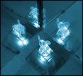
| 08/11/2003 07:46:22 PM |
four trunksby friedd0gComment: While this definitely has right angles in it, I'm not quite sure they're the strength - and the varying pieces of the little light getting cut off in the mirror is kind of distracting, I fear. It's an interesting concept (and a strange little light), but it doesn't really work (at least for me). |
| 08/11/2003 07:38:10 PM |
Hot Mugby scrum8Comment: I especially like the colors in this one - it's a bit grainy and/or blurry here and there. I'm not sure how well that could be controlled with the lighting involved, but it does detract from the power of the photo. I like the effect of heavy lines of the grill against the much softer, paler cup's outline, and the reflections in the cup are a nice touch as well. |
| Photographer found comment helpful. |
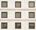
| 08/11/2003 07:33:31 PM |
Three x Threeby sahkoComment: The wall/windows by themselves might be a bit bland - but the reflections captured spice it up nicely. I do wish there had been more reflections, though I don't think you were trying to make them your subject. |
| Photographer found comment helpful. |
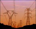
| 08/11/2003 07:17:25 PM |
Linesby jerrftComment: Pretty - I wish it were just a bit crisper, the blur/artifacts in the foreground are a bit distracting to me - but the colors and composition are lovely. |
| Photographer found comment helpful. |
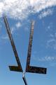
| 08/11/2003 06:56:51 PM |
"Right Angles" Artworkby DrakeComment: I like this one, though I find the amount of open sky at the top distracts me a little from the artwork - when I scroll until the left-hand bar almost touches the top of the frame, it looks even better, tighter, to me. And where/what is this, anyway? It's fascinating. |
Home -
Challenges -
Community -
League -
Photos -
Cameras -
Lenses -
Learn -
Help -
Terms of Use -
Privacy -
Top ^
DPChallenge, and website content and design, Copyright © 2001-2025 Challenging Technologies, LLC.
All digital photo copyrights belong to the photographers and may not be used without permission.
Current Server Time: 04/16/2025 01:26:51 PM EDT.