| Author | Thread |
Comments Made During the Challenge  |
|
|
08/12/2003 05:57:21 PM |
| Good idea let down by poor lighting. |
|
|
|
08/12/2003 12:36:14 PM |
| A bit overexposed to me... |
|
|
|
08/11/2003 11:47:22 PM |
| Lots of right angles, definitely! The way the details are partly lost on the most brightly-illuminated is distracting, though, and I'm not quite sure what the "draw" of the photo is meant to be, or where to rest my attention. |
|
|
|
08/11/2003 11:10:16 PM |
| Little blurry...maybe that was intended but seems to detract. |
|
|
|
08/09/2003 12:36:03 AM |
| Light is too harsh and the picture wee out of focus |
|
|
|
08/08/2003 03:14:59 PM |
| Maybe a little over exposed. I would have tried adjusting the brightness in an editing program. |
|
|
|
08/07/2003 06:52:57 AM |
| Interesting idea, but the picture is out of focus and a bit overexposed. |
|
|
|
08/07/2003 03:08:01 AM |
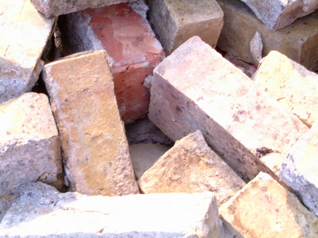
| Wish the bricks were better focused. Colors washed out. B&W with better focus would have increase score. The composition is very good. |
|
|
|
08/06/2003 12:21:42 PM |
| I may be wrong, but this looks overexposed and out of focus. |
|
|
|
08/06/2003 04:08:25 AM |
| good one - pretty natural and kind of unkempt arrangement. but a bit too over exposed. |
|
|
|
08/06/2003 03:52:04 AM |
|
Home -
Challenges -
Community -
League -
Photos -
Cameras -
Lenses -
Learn -
Help -
Terms of Use -
Privacy -
Top ^
DPChallenge, and website content and design, Copyright © 2001-2026 Challenging Technologies, LLC.
All digital photo copyrights belong to the photographers and may not be used without permission.
Current Server Time: 02/01/2026 09:23:31 AM EST.