| Image |
Comment |
| 05/22/2003 11:17:46 AM |
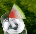
What I Seeby arnitComment: It took me a moment to discover any sort of complementary colour here, and there's far too much expanse of neutral colour between them to make it obvious. The off-center nature of the subject just makes it harder. The natural focus point of the center does not contain the complementary colours (assuming the focus is red/green, and not some sort of very subtle tan/blue vein thing), so you have to search for it. For a topic like this, I prefer a lack of subtlety. In other topics this photograph would probably have rated more highly with me. |
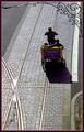
| 05/22/2003 11:15:08 AM |
ride on yellow and purpleby GotchyaComment: I think the focus should have been closer-in to the bike, perhaps cropped there or zoomed in as appropriate. But it's good it's an obvious splash of colour against a fairly neutral background, which helps draw the eye. |
 Photographer found comment helpful. Photographer found comment helpful. |
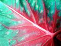
| 05/22/2003 11:14:05 AM |
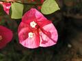
Meeting of Red and Greenby GraciousComment: Wow, very nice way to handle the focus of the challenge, and nice close-up shot. Is this a Coleus leaf? I like the orientation of the color change as well. |
| Photographer found comment helpful. |
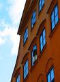
| 05/22/2003 10:20:58 AM |
Reflectionsby mbardeenComment: While I see what you were doing here, and the way the reflection comes off the sky is very nice, I'm afraid the building colour fades into neutrality enough that it doesn't highlight the 'complementary' bit for me. |
| Photographer found comment helpful. |
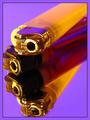
| 05/22/2003 10:20:16 AM |
Yellow and Purpleby CLarson557Comment: Huh.
It fits the theme, and it's an interesting photo, but I think the background probably should have been another shade, and the angle might have been better on the sides of the lighter -- the shininess of the metal draws the eye away from the contrast and onto the shiny yellow bits. |
| Photographer found comment helpful. |
| 05/22/2003 10:18:50 AM |
Floating Flameby TerryGeeComment: Very, very nice choice of angle and placement. Even with the slightly higher orange concentration, the contrast between the complementary colours is obviously the focus of the picture. And it's pretty, to boot! |
| Photographer found comment helpful. |
| 05/22/2003 10:17:48 AM |
Metalic Auroraby adineComment: Okay, this is just plain cool. I know, that's not a terribly useful comment, but it is my reaction. I like the way that the outer top to inner center edges flow light to dark in equivalent contrast levels, very nice emphasis (whether intentional or not). |
| Photographer found comment helpful. |
| 05/22/2003 10:16:20 AM |
ATwist on a Twistby BJComment: Heh, interesting concept, and very nice picture, but it might have served the colouring expectations better to take it against a different background -- there's a bit too much green-flowing-to-green to really emphasize the topic, though the focal object certainly does. |
| Photographer found comment helpful. |
| 05/22/2003 10:15:25 AM |
Less is Moreby danwanComment: Very pretty, and definitely fitting the 'complementary' part. An angle that overlapped leaf and flower would have been even nicer. |
| Photographer found comment helpful. |
| 05/22/2003 10:14:24 AM |
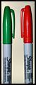
Face Offby magnetic9999Comment: This would have worked better for me if staged with, say, multiple Sharpies of each colour, or perhaps against a backdrop of coloured-in squares on a whiteboard, or something along those lines. As it is, it sort of feels like you picked the first couple contrasting coloured objects you had handy, stuck them next to each other, and gave up. |
| Photographer found comment helpful. |
Home -
Challenges -
Community -
League -
Photos -
Cameras -
Lenses -
Learn -
Help -
Terms of Use -
Privacy -
Top ^
DPChallenge, and website content and design, Copyright © 2001-2025 Challenging Technologies, LLC.
All digital photo copyrights belong to the photographers and may not be used without permission.
Current Server Time: 04/18/2025 03:56:59 PM EDT.