| Image |
Comment |
| 05/22/2003 03:59:14 PM |
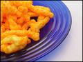
Cheesy and Crunchy - Orange on Blueby StevePaxComment: Crunchy orange worms, my favorite snack!
Nice. Very home-entertainment-magaziney, I could picture it as an ad (I like good commercial work, so this is a compliment). Or accompanying an article on, I don't know, the evil of overly processed cheese. And very definitely topical. |
 Photographer found comment helpful. Photographer found comment helpful. |
| 05/22/2003 03:58:01 PM |
|
| Photographer found comment helpful. |
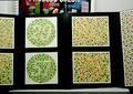
| 05/22/2003 03:57:35 PM |
Uh-Oh...by GeneralEComment: Test if your commenters are colour blind! Ask them about the numbers.
What a terrific way to do this. The contrast between the complementary colours is low but in this case that's just exactly right. |
| Photographer found comment helpful. |
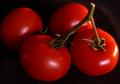
| 05/22/2003 03:56:37 PM |
Tomato On The Vineby STEINRComment: Yummy tomatoes, but I think the contrast between the colour complements would have been highlighted better by tomatoes actually on a vine. The green seems a bit washed out and not as obvious as one might want for this topic. |
| Photographer found comment helpful. |
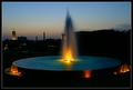
| 05/22/2003 03:55:54 PM |
Glow!by paganiniComment: It's nice to see several pairings of complementary colours in this: the focal point, of course, with the light against the water, but also the orangey tone to the lights around the fountain, the yellow-and-blue sky, and the yellow-lit building against the sky. Plus it's a nice twilight shot of a fountain. |
| Photographer found comment helpful. |
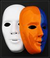
| 05/22/2003 03:54:48 PM |
Mask paradeby AnastasiaComment: This works. You have the orange/blue contrast and the black/white one, and the staging of the scene does not scream "Hi! I'm a big staged scene for the sake of a contest!" as I can imagine someone leaving a couple carelessly piled masks in that way. |
| Photographer found comment helpful. |
| 05/22/2003 03:52:21 PM |
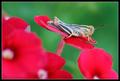
Phloxby GordonComment: The front focal blur rather eye-drawing, which works in the sense that it draws you more to the red/green contrast but does sort of take away from any focus on the bug. |
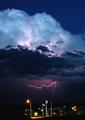
| 05/22/2003 03:51:22 PM |
Natures Purple, Man's Yellowby K-RobComment: Wow this is a very cool picture -- I always have the worst luck trying to capture lightning and so I always appreciate good shots of it -- I think in terms of hitting the depiction of the complementary colours it falls a bit short. Too much of the photo is taken up by the clouds and sky, which add nothing to the point. |
| Photographer found comment helpful. |
| 05/22/2003 03:49:35 PM |
|
| Photographer found comment helpful. |
| 05/22/2003 03:48:38 PM |
Window peepby RobroComment: I have never understood until now why people paint their houses that shade of blue. It's to give photographers a way to enter good pictures into these contests! That's a terrific example of complementary colours, almost precisely as contrasty as they get (I know purple is traditionally considered the complement of yellow, but that blue is actually closer to what I tend to picture it as). |
Home -
Challenges -
Community -
League -
Photos -
Cameras -
Lenses -
Learn -
Help -
Terms of Use -
Privacy -
Top ^
DPChallenge, and website content and design, Copyright © 2001-2025 Challenging Technologies, LLC.
All digital photo copyrights belong to the photographers and may not be used without permission.
Current Server Time: 04/18/2025 03:56:58 PM EDT.