| Image |
Comment |
| 05/22/2003 08:57:24 PM |
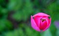
In Low Earth Orbitby magnusComment: I'm really running out of things to say about flowers against grass. As with a couple others, I think this would have worked better with a redder tone to the flower, nad I think maybe less blur of the greenery, but it's certainly topical and not by any means a bad shot. |
 Photographer found comment helpful. Photographer found comment helpful. |
| 05/22/2003 08:56:28 PM |
Two Flamesby pinbackComment: Oh, keen setup. I do wish the flames had been closer in size; the yellow part of the image somewhat outdistances the blue as is. But definitely a nice exercise in the contrast. |
| Photographer found comment helpful. |
| 05/22/2003 08:55:31 PM |
Trappedby OneSweetSinComment: Kind of an odd angle -- I presume that's a shoe atop the ball but it looks rather flatter than I'd expect. Colour choices are good, with matching intensities where the complementary colours meet. |
| Photographer found comment helpful. |
| 05/22/2003 08:54:17 PM |
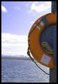
Orange saver at the blue lakeby tyrkinnComment: Both the colour and the positioning of the close element versus the nice landscape help the life ring to stand out. The brightness of the sky does slightly diminish the impact (there's a lot of paler colour around the edges rather than a level of blue that matches the level of orange) but a different angle probably would not have worked as well for framing purposes so that's probably fine. |
| Photographer found comment helpful. |
| 05/22/2003 08:51:04 PM |
Light and Shadowby scrooslooseComment: This is very surreal, but it's a good implementation of the colour complements. I like the fade of light at the bottom, good angle of incoming light; it helps focus on the contrasting colours. |
| Photographer found comment helpful. |
| 05/22/2003 08:49:57 PM |
I'm watching youby MusicmanComment: That's actually kinda sinister looking... Good colour choice, nice angle of shot and focus. Also nice to see something a little different. Fits topic well. |
| Photographer found comment helpful. |
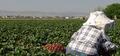
| 05/22/2003 04:14:18 PM |
Strawberry Fields........Forever?by autoolComment: I'm torn. On the one hand, for the sake of the contrast of the complementary colours, I might say "move the focus in on the berries a bit more!" On the other hand, you'd need a new title and that was kinda funny. :)
Reasonable, and a pretty picture. |
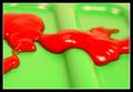
| 05/22/2003 04:13:03 PM |
Oozing..by buzzrockComment: Mmm, looks like bad ketchup on industrial dayglo food tray. No, wait. It looks like spilled... wow, shiny.
Okay, good use of colour, very strange little photograph, and please tell me you plan on eliminating that shade of green from the planet immediately! |
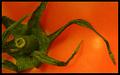
| 05/22/2003 04:11:22 PM |
tomatoby jimmyn4Comment: Ahh, you and the other tomato person should have a talk. Those were redder but the green was weak. This has great green focus but the orange doesn't suit quite as well as a redder tone would. Interesting closeup shot, though. |
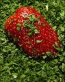
| 05/22/2003 04:10:34 PM |
Strawberry in peppermintby AlexysComment: Hmm. This is a little too staged-arty for my personal tastes but it very definitely hits the topic appropriately and without distraction, so you get a better-than-average vote anyhow. |
Home -
Challenges -
Community -
League -
Photos -
Cameras -
Lenses -
Learn -
Help -
Terms of Use -
Privacy -
Top ^
DPChallenge, and website content and design, Copyright © 2001-2025 Challenging Technologies, LLC.
All digital photo copyrights belong to the photographers and may not be used without permission.
Current Server Time: 04/18/2025 03:56:47 PM EDT.