|
|
|
Showing 111 - 120 of ~574 |
| Image |
Comment |
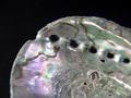
| 06/11/2003 01:10:18 PM | Smithsonianby shareinncComment: I can easily see something like this on a natural-history exhibit focus in the Smithsonian.
It might be slightly too tight a focus as a further crop would make the object harder to identify, but it isn't out of the question. There's enough colour neutrality to easily allow for the placement of coverlines without ruining the intensity of the photo. |
| 06/11/2003 01:07:47 PM | "Country Marketplace"by ReneeComment: Haven't heard of your magazine but I know there are a jillion craft-related magazines out there so no surprise.
This is an ideal photo. It obviously fits a specific article type, it's a pretty, well-lit photo, and there's enough hats showing that any crop required would still work out. About the only place it might suffer slightly is in text composition and if this isn't a full-bleed magazine photo that works out fine. If it is, it might be a little tough to work around the colourful ribbons, though it would be possible, especially if the crop focussed on the left, so it's only a minor flaw at worst. |
| 06/11/2003 01:05:25 PM | Truck Review The 440 Modelby catmanComment: Never heard of your magazine but wouldn't surprise me if it existed. With that in mind and the subtitle...
The shot is actually not bad in terms of lighting or focus but I'd think a truck magazine would want a less tight shot on the logo and show a bit more of the truck itself. The logo also takes up enough of the shot width-wise that I'm wondering how cropping, if necessary, would work. There's certainly plenty of homogenous room to fit text and logos in, however, which helps. |
| 06/11/2003 01:04:05 PM | Travel & Leisure (Cincinnati)by lecalanComment: This is a wonderful photo in general; I love the lighting, it's very crisp, it's a good angle to do this from.
Topically it fits your magazine choice well.
My only complaint would be from a compositor standpoint. There's room for the logo and other top matter, but it would be difficult on a shot with this much colour contrast to fit in coverlines. I see a couple spaces where one could do it (the water, above the bridge) but it'd be tight to work with it. It's possible some judicious desaturation or other adjustment would fix this, though. |  Photographer found comment helpful. Photographer found comment helpful. |
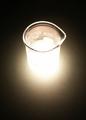
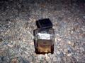
| 06/11/2003 12:59:40 PM | New Scientistby PaulkComment: Topically the photograph is fine, I can easily see this on New Scientist with the right article. I think you would have been better off with not quite so bright of lighting glow. The fade on the light would also have been softer which would help the compositor. The sharp focus on the top edge of the focus is good but it loses some at the bottom edge of the rim because of the lighting as well. | | Photographer found comment helpful. |
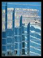
| 06/11/2003 12:56:46 PM | International Glass Reviewby JakComment: Hadn't heard of your magazine before this but it doesn't surprise me in the least an industry-specific magazine like this exists. The photo fits the topic. I think its possible the reflection in the building shows up a little TOO well, maybe because of how highly-lit it is, in terms of attractiveness of photo, though if that were the point of the article I suppose that would make sense. I just am not sure where a compositor would fit text easily. As an industry-style magazine photo it's fine even if I wouldn't exactly hang it on my wall. |
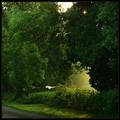
| 06/11/2003 12:49:39 PM | Country Livingby jjbeguinComment: It's a pretty photo with nice lighting -- I like the hazy lighting come through the trees and the small bit of bright up near the top. I don't know your magazine and haven't looked it up, so I'm judging by title alone. It is a country-looking scene (at least it is a non-urban looking one) so it's obviously somewhat topical, though I'm wondering if a 'Country Living' would be more inclined to show a scene that seems more inhabited than this; it helps you have a solid path running through the left bottom corner, so it doesn't feel entirely remote. | | Photographer found comment helpful. |
| 06/10/2003 08:33:40 PM | Amaretto on the...by qachykComment: Thanks to everyone who commented.
The glare is a problem, I agree, but no angle I did this at avoided it entirely and I hoped it being off the label and liquid themselves would help a bit with that.
This was taken in a patch of rocks underneath an overhang and some stairs, so daylight really didn't reach in, hence the flash. I didn't want to walk around carrying an open bottle of liquor or I might have taken it down the street to the next closest patch of rocks. We're kinda short on landscaping rocks around here, alas.
It's centered on the rocks because I wanted the rocks surrounding it and because I wanted to not show the wall behind it, which is boring and ugly. I did have a couple off-center pictures but you could always see the wall or not read the label, so I ended up picking this one. I suppose I could have cropped the wall out of one of the other ones, maybe that would have worked better. Or just cropped this one differently. I like to avoid big crops personally but I should probably get over that. (I did crop this, mostly to get rid of my foot, heh, but it was a very small crop (I think it was just my heel you could see -- oops).)
It's Amaretto specifically, if anyone wondered, because I think the bottle itself is very pretty.
Also, thank you to the 7 people who represent my first votes above a 6. :) |
| 06/10/2003 08:17:18 PM | Anticipationby adineComment: Wow, I'm really surprised this didn't place higher. I just wanted to say this was my favorite of the photos I'd seen and while I suppose 15th out of 202 is not a bad place (top 10%!) I liked this considerably more than the winners (no offense to the winners).
Also, who the HECK voted this a 1? They're on CRACK. Heck, even the 2s and 3s I don't really get. | | Photographer found comment helpful. |
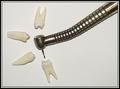
| 06/10/2003 02:19:25 PM | This Won't Hurt A Bitby GolferDDSComment: This is only the second photo I'm looking at but I strongly suspect it will retain its originality throughout. Despite being very staged I think it's a good idea; it's 'arty' and I'm perfectly fine with the 'dentist office' relation to the topic. | | Photographer found comment helpful. |
|
Showing 111 - 120 of ~574 |
Home -
Challenges -
Community -
League -
Photos -
Cameras -
Lenses -
Learn -
Help -
Terms of Use -
Privacy -
Top ^
DPChallenge, and website content and design, Copyright © 2001-2025 Challenging Technologies, LLC.
All digital photo copyrights belong to the photographers and may not be used without permission.
Current Server Time: 04/18/2025 04:01:01 PM EDT.
|