| Image |
Comment |
| 05/28/2003 11:59:51 PM |
|
| 05/28/2003 02:34:30 PM |
|
 Photographer found comment helpful. Photographer found comment helpful. |
| 05/28/2003 02:27:52 PM |
|
| Photographer found comment helpful. |
| 05/28/2003 02:24:24 PM |
|
| Photographer found comment helpful. |
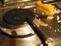
| 05/28/2003 02:21:51 PM |
Italian cuisineby gceramiComment: The focus is a bit rough in this photo, Im not sure what im supposed to be looking at, the grill, the arm, the droplet or the peice of pasta... I feel of all of the interesting things going on in the picture, you may have chosen the wrong one to be the center of attention. Thoe colours are warm and inviting, and do well to give a homely feeling. The highlights are a bit bright and some difusion may have improved it. It's made me hungry :) |
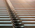
| 05/28/2003 02:16:51 PM |
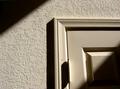
Hallway in morning lightby caroleeComment: Nice lighting and strong contrast make this an enjoyable photo to look at. There is a bit of distortion on the bottom right. Having the lines placed perfectly horizontal and vertical may have improved the strength of the picture, and enforced the already strong contrast. Doing that gives less of a homely feeling and that might not be preferred. Nice Photo. |
| Photographer found comment helpful. |
| 05/28/2003 02:03:11 PM |
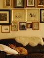
"My HoMe"by KIKIComment: I like the way the squares interact with the organic shapes of the couch and the dog. I feel that the white furry thing on the top of the couch balances out the dog on the bottom of the couch nicely, preventing it from weighing it down to the left. I think that the pillow that your dog is comfortably sleeping on should not have been in the picture, because it's too bright and large, and it throws off the nice warm browns a bit too much. Nice job. |
| Photographer found comment helpful. |
| 05/28/2003 01:52:32 PM |
|
| Photographer found comment helpful. |
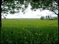
| 05/28/2003 01:51:47 PM |
highlandterby salparadiComment: The focus of the photo is well defined. The single green element is perfect for drawing your attention. I looked there first. I feel that the contrast is a bit too high, and information is lost in the dark end of the histogram. The power lines running through the picture are placed nicely, revealing triangular shapes in the negative space, however they do tend to lead my eye away to noting on the right side of the picture. Nicely done. |
| Photographer found comment helpful. |
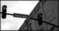
| 05/28/2003 01:47:05 PM |
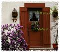
17by nathaliedooComment: A nice red door. It looks a bit dark here, and the colours loose some of their brilliance. I love the light tree limbs on the right. The come into the frame and break up the vertical lines. If the lower one was a bit lower, not to make it look like it was part of the wreath, the photo would be improved. |
Home -
Challenges -
Community -
League -
Photos -
Cameras -
Lenses -
Learn -
Help -
Terms of Use -
Privacy -
Top ^
DPChallenge, and website content and design, Copyright © 2001-2025 Challenging Technologies, LLC.
All digital photo copyrights belong to the photographers and may not be used without permission.
Current Server Time: 04/12/2025 06:59:55 PM EDT.