| Image |
Comment |
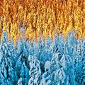
| 12/01/2007 02:55:57 AM |
Colder & Colderby korpenComment: Not sure how you've done this, not overly keen on it to be honest. The top half of the image looks more yellow on my display than orange and so is struggling a bit to complement the blue |
 Photographer found comment helpful. Photographer found comment helpful. |
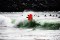
| 12/01/2007 02:54:25 AM |
fish outa waterby jaimeDpComment: Difficult to quite make out what the main subject is and the title is not giving much away. Lovely green hues take up more area of the image than the red, but you still achieve colour balance by saturating the red a lot more so thats very good. |
| Photographer found comment helpful. |
| 12/01/2007 02:51:58 AM |
Sun on the wireby docjonnyComment: The blue is simply not strong enough to be complementary to the orange hues. Interesting aspect ratio |
| Photographer found comment helpful. |
| 12/01/2007 02:51:07 AM |
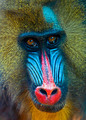
'Tis the Seasonby cutlassdude70Comment: Focus is just on the fringe and slightly off on the eyes which kills this for me. Whites of eyes have a red colour cast, lipstick on teeth and multiple catch lights on eyes. Green colour is not of the same order of saturation as the red and so is a little unbalanced. Well composed though. Questionable border - would have been better to have used the same green colour as the average green in the image rather than RGB 0, 255, 0 |
| Photographer found comment helpful. |
| 12/01/2007 02:47:01 AM |
Dreamtimeby sherpetComment: Nice and sharp, good contrasting colours. Well composed, nice and simple, should do well |
| Photographer found comment helpful. |
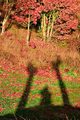
| 12/01/2007 02:46:14 AM |
Autumn Self Portraitby anirenoComment: The shadow is too unconventional for me I'm afraid. This idea of the shadow self portrait would have worked against a plain/uncomplicated background, but then you wouldn't have the complementary colours and shadows are not known for their colour. |
| Photographer found comment helpful. |
| 12/01/2007 02:43:56 AM |
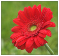
red and greenby margiemuComment: Just not quite as sharp in the centre of the flower head as it could be. This might have just been because of the image size reduction to 640 for the entry - always worth doing one final USM before submission and I think this would have helped here. Nicely balanced colours though |
| Photographer found comment helpful. |
| 12/01/2007 02:42:07 AM |
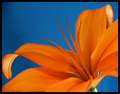
Be my friendby JaimeVinasComment: The other non-complementary colours are a bit of a distraction. This seems more blue/red to me rather than blue/orange which could have easily been changed during PP |
| Photographer found comment helpful. |
| 12/01/2007 02:40:34 AM |
In Memory of Springby arron_christensenComment: Lovely strong contrasting colours. Well composed. Not much detail on the stamen, if thats the right word, and this is where your focus is and so the image as a whole looks a little out of focus. If there had been a bit of mist on them to bring out a bit of sparkle and detail then that would have given the whole image a real boost. |
| Photographer found comment helpful. |
| 11/30/2007 03:59:44 AM |
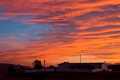
Custom-Ordered Cloudscapeby lynnesiteComment: The orange fades into the blue and so you lose the strong constrast effect of having two complementary colours adjacent to one another which is a shame as its a lovely sky. |
| Photographer found comment helpful. |
Home -
Challenges -
Community -
League -
Photos -
Cameras -
Lenses -
Learn -
Help -
Terms of Use -
Privacy -
Top ^
DPChallenge, and website content and design, Copyright © 2001-2025 Challenging Technologies, LLC.
All digital photo copyrights belong to the photographers and may not be used without permission.
Current Server Time: 04/16/2025 05:03:10 AM EDT.