| Image |
Comment |
| 12/05/2007 03:44:09 AM |
|
 Photographer found comment helpful. Photographer found comment helpful. |
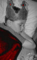
| 12/05/2007 03:42:46 AM |
little princeby laurie241Comment: Quite a strange depth of field effect you have going on but the face is in focus which is the important thing here so thats good. Not sure the red colouring works, normally you would have single coloured objects in a mostly mono image to draw attention, but here, the red elements are not in focus and the main points of interest given you title and the brief should be the boy and the book which are left mono. So your intention by doing this colouring seems a little confused. Mono tones could have been pushed harder as they are a little washed out |
| 12/04/2007 03:58:19 AM |
|
| Photographer found comment helpful. |
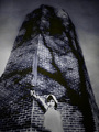
| 12/04/2007 03:56:19 AM |
Childe Rowland at the Dark Towerby KelliComment: Something about the lighting on the figure doesn't look right and appears superimposed into the tower image and seems very disconnected. Holding the sword in the air comes across to me as being comical which is quite the opposite feeling I get from the tower and the sky and this further adds seperates the tower and figure. Lovely tones and patterns on the tower, would have had more impact on its own |
| Photographer found comment helpful. |
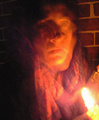
| 12/04/2007 03:52:22 AM |
The Little Match Girlby snafflesComment: Too blurred I'm afraid, simply not enough light to capture a moving subject. I can see you used a tripod as the brickwall is sharp but as this is essentially a portrait, the girl needs to be sharp too. |
| Photographer found comment helpful. |
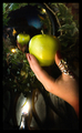
| 12/03/2007 03:49:38 AM |
Mirror Mirrorby TiNComment: Where does the apply come into this? A reflection of a pretty girl would have perhaps been more fitting. Nice colours and dreamy, blurry lighting effects |
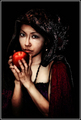
| 12/03/2007 03:47:20 AM |
...as soon as she bit the apple, she sank into unconsciousness...by booboo_goonComment: The DOF looks a little faked, there seems to be a bit of a blur halo around the apple which isn't natural to me. The background looks nice but the apple itself is not in keeping with the rest of the image somehow. A bit too much post processing - its very high contrast, the specular highlights are burned out and the apple is very strongly colour saturated. |
| 12/03/2007 03:44:05 AM |
Once Upon a Timeby heavyjComment: Looks incredibly overprocessed and have become a cross between a painting and CGI. Some might think its great and fits the challange well but its not for me. |
| Photographer found comment helpful. |
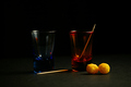
| 12/01/2007 03:09:57 AM |
Aperitifby caro_08Comment: Very dark, would have lost the ball things as then unbalance the composition. This looks more like red/blue rather than orange/blue on my display which is a shame. The red is much stronger than the blue and so further adds to the unbalance. Red tones are visible as reflections in the blue glass which is nice but hasn't worked the other way around - so more unbalance. Apart from the reflection, the blue and red are in the main, seperated from one another by the background and so you lose the high contrast attained from having complemenary colours against one another |
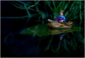
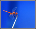
| 12/01/2007 02:58:49 AM |
Dragonflyby CraftyComment: Excellent sharpness and detail which is enhanced by having a neutral background. The blue takes up a lot more area than the orange but you achieve balance well by ensuring that the orange is more heavily saturated so thats very well done. The only thing that is a bit questionable is the relatively elaborate border which distracts from some of the detail on the dragon fly. |
| Photographer found comment helpful. |
Home -
Challenges -
Community -
League -
Photos -
Cameras -
Lenses -
Learn -
Help -
Terms of Use -
Privacy -
Top ^
DPChallenge, and website content and design, Copyright © 2001-2025 Challenging Technologies, LLC.
All digital photo copyrights belong to the photographers and may not be used without permission.
Current Server Time: 04/16/2025 05:05:40 AM EDT.