|
|
| Image |
Comment |
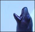
| 06/14/2003 08:32:48 AM | Noisy, Hungry Sea Lionby StevePaxComment: GREETINGS FROM THE CRITIQUE CLUB!
Well, I wish I had more to say about this picture....
Its great. I like the crop choice. The detail looks sufficient, maybe a bit obscured by the darkness in the shadows. A lot of others have commented about the blue cast and I think they're right, it detracted from the photo. Im guessing your score would have easily gone up a whole point if this wasn't the first thing to hit many a viewers brain.
 |  Photographer found comment helpful. Photographer found comment helpful. |
| 06/14/2003 08:27:16 AM | you QUACK me up!by TerryGeeComment: GREETINGS FROM THE CRITIQUE CLUB!
Nice photo here. I agree with Galina about the greenish cast on the feathers. The image looks as if it is a bit dark. Maybe a levels adjustment to bring everything up a tad. Otherwise the detail on the bill is nice and sharp, nice colors there too. Its a shame that there wasnt maybe more reflection/glare coming off of the eye, that way it would have a little bit less of a flat feel. I think maybe the only real major improvement I could suggest is a more interesting crop/composition, as Mavrik has alredy noted.
Good shooting.
|
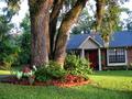
| 06/10/2003 01:10:26 PM | Me Casa!by BudweezerComment: GREETINGS FROM THE CRITIQUE CLUB!
REACTION: Ok, the colors are pretty vibrant. But after that, my initial reaction to this photo is "Oh boy, Im looking at someone's front yard." I dont want to look at your front yart unless there is something amazing, funny, disgusting.... UNIQUE about it. Im not saying your house or yard is hard on the eyes... just give me something 'more'. Im greedy like that.
COMPOSITION: I think a different angle could have made a world of difference for this shot. As far as cropping is concerned, I have a bit of a problem with the left side of the tree. There isnt really anything going on over there...
The more I look at the shot the more it appears technically fine. What Im really wanting is a fresher perspective on your yard. ;)
|
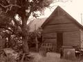
| 06/10/2003 12:51:49 PM | "Not Forgotten"by Denise CataniaComment: GREETINGS FROM THE CRITIQUE CLUB...
This is a nice subject to have portrayed in the sepia tone. The rustic nature of the home, coupled with the deteriorating artifacts work well. The lighting is ok, though might have been pushed just a bit dark.
I think the photo could have been improved the most by taking a more unique perspective. From the looks of it, this shot was probably taken standing up with the camera held at eye level. Unfortunately, 90% of photographs are taken from this vantage... and thus it quickly becomes this photo's disadvantage.
Try gettting a handful of different angles. Try shooting low, from the side. Maybe get one of those interesting objects, like a tire or something, in the foreground.
In short, adding a unique perspective that is something other than a typical standing-eye-view would add more interest to this already decent picture. |
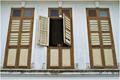
| 06/10/2003 11:35:17 AM | The Heritage of Tanjong Malimby tkonxComment:
GREETINGS AND SALUTATIONS FROM THE CRITIQUE CLUB!!
I apologize in advance if the critique seems a bit brief, as I don't find much room for improvement on the basics. Composition, focus, and lighting are all fine... so Ill leave a few words on my personal 'reactions' to this picture.
Personally, and I emphasize 'personally' because others below disagree, I dont think the photo conveys much 'heritage' of the Tanjong Malim. To me these windows aren't 'obviously eastern', and if asked to guess, I wouldnt even know what culture to guess these windows came from. The tea kettle, as a nice clue, is too hard to see in this composition.
I seem to be yearning for something 'more distinct', and I think that by either pulling back and capturing more of the building with its architectural details, or getting closer in intimate with some of these details, you could have captured this 'heritage' a little better. |
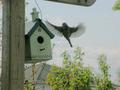
| 06/10/2003 11:15:04 AM | Home at lastby ColeyComment: GREETINGS FROM THE CRITIQUE CLUB.... or something like that...
Well, I see you scored a 5.1 on this shot. Quite frankly, Im surprised. I would have rated this at a 4 or so....
The most impressive aspect of this shot is the capture of the bird. His (or her!) wings are caught in full spread, a very powerful looking pose. The feathers are perfectly spread out and are a little blurry, but judging buy the shutter speed, that couldnt have been helped.
So the bird is amazing.... but unfortunately, the whole rest of the shot detracts from this.
COMPOSITION: I think you could have obtained a better crop by cutting some of that vertical post our of the picture. If not removing it entirely, at least get rid of the small shred of sky to the left of the post. Same thing with the top of the shot. I think the post that angles down into the top of the frame is distracting. I think the composition is the main thing that kills this picture. Next time try to obtain a setup that you would want to look at even without a bird, then wait for it to fly into the shot and SNAP!
FOCUS: As others have mentioned, the shot kind of feels out of focus. The trees in the background definately, and at an aperture of 7, thats how it should be. I think if you dropped the aperture even lower, making the background completely out of focus, it'd draw even more attention to the bird and house, and then the trees wouldnt be distracting us at all.
In sum, next time pay more attention to how all the elements in your shot are framed before you make the shoot. Try to get an arrangement that looks pleasing to the eye BEFORE the bird gets involved, that way when you get a great capture of a bird such as this, you dont have several background elements distracting from it.
| | Photographer found comment helpful. |
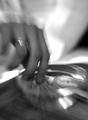
| 06/10/2003 10:13:13 AM | Eating in bedby birkirComment: Greetings from the Critique Club... (thought I've heard others say this)
Well, Im not sure this 'interesting' photo warrants the as low a score as it recieved. The blur caused by the zoom-during-exposure was intentional, and makes you look twice, which is good. The photo works ok as an abstract image, but I think the problem is we keep getting drawn back to look for more, only to get rejected each time. In these zoom type of shots its often nice to have at least a fragment (the center) of the shot decently crisp, the zoom then draws our attention and focuses it there. I have a problem glancing around at each portion of this image, only to be left more confused: I cant tell if the white background area is a shirt of bedsheet, I cant tell if the hand is male or female, as mentioned by others, it looks like a cigarrette and ashtray as opposed to the 'traditional' breakfast in bed. Again, its fine and lovely to make a play on the theme (ie cigarrettes ARE the food) but with an image as unclear as this, several viewers wont bite.
In sum, I think the image is interesting at the onset, as I like the technique and abstract feel, but at the end of the day it leaves more questions than answers, lacking focus on a visual 'punchline' to keep us coming back for more. |
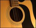
| 06/04/2003 06:11:13 PM | Note of Dby KneeforuComment: Normally a shot like this would be dreadfully boring, but the cropping choice is interesting. You captured the hues of the wood really well also. The black background is a perfect match to the scratch-protector (I forget the name), making an undulating pattern of black, yellow, black, yellow, black yellow... (8) | | Photographer found comment helpful. |
| 06/04/2003 06:05:17 PM | Tiny Heart Beats by lmhrComment: Nice. The soft light is good.... its a great shot. I cant offer too much of a critique, sorry! Nice unique interpretation, keep it up. (10) | | Photographer found comment helpful. |
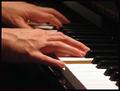
| 06/04/2003 06:01:49 PM | Universal Languageby karmatComment: I was getting so sick of seeing Hands-on-the-Piano shots I was marking them way down, but this has to be most appealing execution of the bunch. I cant critique the technicals of the photo, its pretty flawless. I like the title, but the shot still loses crucial creativity points for being associated with the cliche. (7) | | Photographer found comment helpful. |
Home -
Challenges -
Community -
League -
Photos -
Cameras -
Lenses -
Learn -
Help -
Terms of Use -
Privacy -
Top ^
DPChallenge, and website content and design, Copyright © 2001-2025 Challenging Technologies, LLC.
All digital photo copyrights belong to the photographers and may not be used without permission.
Current Server Time: 04/12/2025 06:56:35 PM EDT.
|