| Image |
Comment |
| 03/23/2007 10:16:35 AM |
Tiny Angelby fordmanf1Comment: good composition and decent lighting; very sweet. Coloring seems somewhat dull though... very nice overall though. 6 |
 Photographer found comment helpful. Photographer found comment helpful. |
| 03/23/2007 10:00:49 AM |
Outdoor Portraitby NVPhotoComment: Pretty subject. Having said that, this picture could have been better. Her eyes are almost closed; I realize she's looking below the camera, which you may have intended, but it feels like you caught someone laughing at your open zipper. Or maybe she's just playing with a child who is cropped out, but that isn't apparent. Almost makes her look cross-eyed.
Also, her stance is akward, it seems like she's hunching or leaning back on something; it feels very unbalanced, like there's more happening to the right that whould have been included.
On a positive note, I like the lighting and DOF; the focus is on her face, where it should be, not distractions behind her. Kind of pulls attention to the necklace as well. |
| 03/19/2007 10:46:50 AM |
I'll Take 3!!!by adam_nichollsComment: Originally posted by MaryO:
I don't happen to get all emotional about cars (which may explain why I'm happy driving a minivan), but I know other people do, and this is the kind they fall in love with. Would have liked it a wee bit better if you could have stood a little to the right so the stuff on the right in the back could be cropped out, but don't know if that was possible. |
I like the angle, but have to agree with cropping the (Maserati) objects out of the background. Also, I think the a little more lighting on the far side of the car would help, although you probably didn't have much control over that... |
| 03/19/2007 10:44:09 AM |
definition of loveby KrystleComment: Originally posted by OrionThe Hunter:
The Text not being stright across the photo take away from this photograph. |
I actually am glad the text isn't horizontal, would have made this very boring. I would have liked a better view of the bears though, maybe turned them so the camera is looking over red's shoulder...
p.s. Definition 2 is what makes this shot so great to me; sticky bear hugs are definately the personification of love... :D |
| Photographer found comment helpful. |
| 03/13/2007 10:34:56 AM |
Waiting...by oscarmeyerComment: very unique and creative take on this challenge! Good detail on the texture, I wish there was more DOF though. Decent composition, but did you mean to have the top/bottom borders wider than the side ones? |
| Photographer found comment helpful. |
| 03/13/2007 10:31:45 AM |
|
| Photographer found comment helpful. |
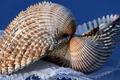
| 03/12/2007 02:17:27 PM |
Textures in a Kissby ninaullerComment: Originally posted by BigSmiles:
This is my favourite texture picture for several reasons. There is a dominant S curve in the way the seashells are arranged which makes for awesome composition. There are several noticeable textures within the entire image. The lighting is well done and the DOF was well handled. The arrangement is kept simple and there is nothing complicating the image! Gets a 10 from me. BigSmiles |
Exactly what I would have said if it weren't easier to quote it! Great texture shot. |
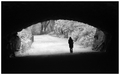
| 03/09/2007 12:47:50 PM |
A Silent Exitby meetpdComment: I really like the mood and composition here. Definately a great take on the challenge; great darkness into light feeling. However it feels like it's off-balance; I can see how the shadows might not be horizontal, but she seems to be falling over. I think this would look much nicer rotated upright, and crop the top and bottom about 10% each (also a smidgeon off the right). |
| Photographer found comment helpful. |
| 03/09/2007 10:54:31 AM |
Wish You Were Here....by kretsComment: I couldn't resist playing with this... sorry if this offends you, but I had to straighten this out and take out the wire just to see; it just had so much potential! I'll galdly remove these if you want, just let me know.
2 versions - identical except border.
//homerbob.8m.com/pix/palm_edited_noborder.jpg
//homerbob.8m.com/pix/palm_edited.jpg Message edited by author 2007-03-09 15:59:30. |
| 03/09/2007 09:56:29 AM |
Eight Ball -- Corner Pocket by langdonComment: Originally posted by Nightson:
I think it might have been interesting to shift the focus onto the 8-ball, it would have given a different take on the shot |
I would like to see this reshot with the 8 in focus... I like the cue centered under the light though, a great picture overall!
|
| Photographer found comment helpful. |
Home -
Challenges -
Community -
League -
Photos -
Cameras -
Lenses -
Learn -
Help -
Terms of Use -
Privacy -
Top ^
DPChallenge, and website content and design, Copyright © 2001-2025 Challenging Technologies, LLC.
All digital photo copyrights belong to the photographers and may not be used without permission.
Current Server Time: 04/07/2025 05:52:50 AM EDT.