| Image |
Comment |
| 11/10/2015 03:38:00 AM |
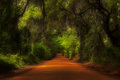
Orchard Pond Canopyby bennettjamieComment: Thank you! Im very excited! Annd, whats cool about this photo is that this road is not going to be here anymore, it is currently under construction to become a toll road and it's beauty will be gone! |
| 10/07/2015 05:10:35 AM |
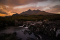
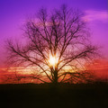
Red Dreamby Alex_PetriniComment: Enter your comment here, and then cast you//www.dpchallenge.com/challenge_vote_image.php?IMAGE_ID=1166157#r vote... |
| 10/01/2015 05:50:57 AM |
|
 Photographer found comment helpful. Photographer found comment helpful. |
| 08/19/2015 05:54:19 AM |
|
| Photographer found comment helpful. |
| 06/09/2015 05:23:58 AM |
Little Divaby bennettjamieComment: I didn't think my photo was still entered. Every time I uploaded it, this green line appeared...so I deleted my entry...apparently it didn't delete like I thought. The file on my end isn't corrupted so I don't understand what is going on except that it made my score extremely low lol |
| 05/05/2015 10:38:44 AM |
|
| 05/05/2015 10:07:43 AM |
|
| Photographer found comment helpful. |
| 05/05/2015 10:07:14 AM |
A real charmerby Yo_SpiffComment: Love the perspective and composition, however the grey tones are too similar for me. If the subjects tones were darker perhaps it would "pop" and be more distinct? just a thought. Great job tho. |
| Photographer found comment helpful. |
| 04/13/2015 07:00:48 AM |
Hues of lightby bennettjamieComment: Originally posted by giantmike:
I meant to comment on this during the challenge, then I ran out of time.
Overall, I like it. A center composition can be bold and interesting, if done right. This meets that.
However, there were two main dis-tractors:
1. There is too much deep black on the bottom. Cropping that could have helped.
2. The saturation is pushed too high. The colors seem to be neon. While I'm sure this was a colorful event, I doubt it had this kind of saturation. I got back to know of my photos from a few years ago where I did the same thing. I learned a lot from that photo :) |
Yea, when I upload to DPC the image looks sooo overly saturated so I need to go into photoshop and look into that. I agree for sure, way oversaturated!
Thanks for the comment and advice. Im proud of it, and I think the square crop and it being centered works perfectly too! |
| 04/13/2015 05:28:43 AM |
|
| Photographer found comment helpful. |
Home -
Challenges -
Community -
League -
Photos -
Cameras -
Lenses -
Learn -
Help -
Terms of Use -
Privacy -
Top ^
DPChallenge, and website content and design, Copyright © 2001-2025 Challenging Technologies, LLC.
All digital photo copyrights belong to the photographers and may not be used without permission.
Current Server Time: 04/07/2025 06:15:07 AM EDT.