| Image |
Comment |
| 11/05/2004 04:33:36 AM |
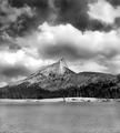
Cathedral Peakby PaigeComment: I sort of scrolled cropped off at least a third of the water on this shot and the emphasis went immediately to the drama happening in the sky |
 Photographer found comment helpful. Photographer found comment helpful. |
| 09/08/2004 10:58:41 AM |
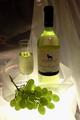
Light and Fruityby LisaCanComment: nice try but think you need another light source to really add some puch to the image |
| Photographer found comment helpful. |
| 09/08/2004 10:54:37 AM |
Blue Laceby SamaraComment: Really nice ide but a slight counterclock wise rotation would have helped the angle being off is distracting was sitting here leaning side to side to get a more level look to it. I wold have liked to see bit more of the shadow if possible. or isolating one of the vases for a more dramatic efect. This is an idea to play around with again it has a lot of potential |
| Photographer found comment helpful. |
| 08/12/2004 05:40:01 PM |
Walk with me.by jkuangComment: this such a nice photo but the bright white of your virtual mat seems too bright and I find that it is very distracting |
| Photographer found comment helpful. |
| 07/26/2004 05:33:10 AM |
DOCILE PIECES of CEDARby timganierComment: this was a really sweet cover but you like many others in this competition need to take a look at your selection of fonts, typography is an art and the image and text meld into one statement. Really liked it much better when I didn't see the bottom text. Nice still the same |
| Photographer found comment helpful. |
| 05/26/2004 08:08:04 AM |
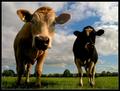
Curious Cowsby e301Comment: Love it too bad athe black and white cow lost it's detail but sweet photo |
| Photographer found comment helpful. |
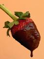
| 03/26/2004 07:31:28 AM |
PHOTOgraphic - February 2004 issue (www.photographic.com)by jealbornComment: I hate to be negative.For some reason, I found this has to be the most unapplealing shot's of a strawberry. The lighting is off it has a real dead spot on the lower left . you could try using a reflector oruse more lights to mold the berry bette and make it mor 3 dimensionalr. it is the color of the background that might be adding to my feeling about this shot. Normally don't give comment , you had a good idea. I'd give it another whirl using more light and experimenting with the background color. |
| Photographer found comment helpful. |
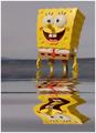
| 03/26/2004 07:20:27 AM |
Nickelodeonby cabaComment: cute idea and nice shot but Sponge B color looks so flat due to the lighting |
| Photographer found comment helpful. |
| 02/18/2004 07:19:05 AM |
She Sells.....by vtruanComment: really like the boldness of the shapes and colors but would also like to see the images sharper for more impact |
| Photographer found comment helpful. |
| 02/11/2004 04:30:53 AM |
|
Home -
Challenges -
Community -
League -
Photos -
Cameras -
Lenses -
Learn -
Help -
Terms of Use -
Privacy -
Top ^
DPChallenge, and website content and design, Copyright © 2001-2025 Challenging Technologies, LLC.
All digital photo copyrights belong to the photographers and may not be used without permission.
Current Server Time: 04/11/2025 12:04:26 AM EDT.