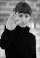
Adagio
by
KarenNfldComment: Hello Karen,
Nice shot. Congratulations on the ribbon.
Something for you to do next time. I looked at the other photo too. Maybe they are the way you want/wanted them to look. But, possibly you didn't see "how" they looked.
Let's use as an example a beautiful summer day, where the sky is so beautiful, a very beautiful BLUE. We have all seen days like that I would suppose.
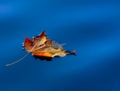
Or looking at a lake like Crater Lake, Oregon, USA. The water in the lake is so pretty a BLUE that it looks FAKE. But it isn't. The water is over a thousand feet deep in Crater Lake.
IF we were to take a clear glass and dip out a glass of water from Crater Lake, it would be crystal CLEAR. Follow so far? If we were to dip out a clear 50 gallon barrel full, we could look right through the barrel because the water would be crystal clear.
When we look at the mountains in the distance, they sorta look blue sometimes, don't they? But when we drive down the road, we do NOT see BLUE between us and what we are looking at. Everything is CLEAR. The air is clear. (mostly) So is water.
IF your photo looks like you wanted it to look, then you did great.
IF your photo was supposed to look "real", then you didn't do good. It looks fake. Both of them do.
Caught my eye instantly.
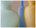
Color in water or in the sky is caused by depth. The deeper the water, the bluer (or greener, etc) it gets.
With a photo like yours, we can imagine the water is a hundred feet deep and it IS that beautiful blue color. Makes for a very pretty photo.
But, where the water is only a mm or two deep, like over the tip on the right side and on the left side by the stem, it HAS to be clear to be real. Just like the glass of water from the lake, it is NOT blue, it is clear.
Where the water is over the bottom of the leaf there is just a faint blue tint, most wouldn't see it there.
So, try this: take another copy of your photo and mask the areas where the water is OVER the leaf, THEN do your saturation changes. The water showing OVER the leaf will be clear like it is supposed to be.
Something like that, "most of the time", doesn't get thought of. Even though I don't take photos worth a dang, most of mine are snapshots, I still know HOW a photo should look.
Please don't take what I said wrong. You are still learning, we ALL are. (hopefully)
And for the person who left the comment:"Will the idiot who voted this a "1" plese (sic) stand up! At least stop voting!"
The person who voted the "1" probably seen what I seen, they are someone who "knows" what a photo should look like to be "real".
Just because of that "blue tint" where it shouldn't be would have dropped it from a 9 from me to a 4 or 5 because it screams fake so loud.
Karen, you did a great job, the next time, make it perfect! Again, congratulations on the ribbon!
Regards,
Ken