| Image |
Comment |
| 09/01/2008 07:55:21 AM |
Threatening Skiesby scooter97Comment: Very vibrant colors, and I like the contrast against the dark clouds. You might find you get higher scores if you use the full image size allowed in a challenge, though. |
 Photographer found comment helpful. Photographer found comment helpful. |
| 09/01/2008 07:26:37 AM |
|
| Photographer found comment helpful. |
| 09/01/2008 07:25:50 AM |
Going To Need a Bigger Poleby jbrightComment: I like the silhouettes, and the title made me chuckle. The sunset colors seem a little muted, and I might have cropped out some of the water at the bottom. |
| Photographer found comment helpful. |
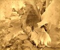
| 09/01/2008 07:24:00 AM |
end of seasonby tnunComment: I don't really like the processing on this one as it doesn't provide much in the way of contrast. Also, the crop could be tighter on the spider. There are some really great textures on that leaf, and I think that a lower angle could have made better use of them as a backdrop for the spider. |
| Photographer found comment helpful. |
| 09/01/2008 07:20:54 AM |
The Revelationby riotComment: I think a softer light source would have helped this image. As it is, the shadows are very sharp, and the highlights are blown out. |
| Photographer found comment helpful. |
| 09/01/2008 07:17:19 AM |
|
| Photographer found comment helpful. |
| 09/01/2008 07:10:49 AM |
Happy Daysby cheegirlComment: Brilliant! Bright, sharp, vibrant. . . and funny as well! I have a feeling that this image is going to do extremely well! (And not just on DPC!) |
| Photographer found comment helpful. |
| 09/01/2008 07:06:10 AM |
Pollinationby PhotomouseComment: Excellent macro shot! Good detail, and the focus is right on. I really like the vibrant colors here as well. |
| Photographer found comment helpful. |
| 09/01/2008 07:04:32 AM |
The Raceby kellyoComment: You have achieved a great sense of motion with the panning, but the square crop does not leave them anywhere to go in the image. A little bit of space to the left would have helped, I think. |
| Photographer found comment helpful. |
| 09/01/2008 07:02:28 AM |
The Soloistby JammurComment: Really, really, good! I like the clean lines and simplicity of the silhouettes against that pure white background. I think what really makes this image stand out, however, is the lighting and detail still evident in the trumpet. |
| Photographer found comment helpful. |
Home -
Challenges -
Community -
League -
Photos -
Cameras -
Lenses -
Learn -
Help -
Terms of Use -
Privacy -
Top ^
DPChallenge, and website content and design, Copyright © 2001-2025 Challenging Technologies, LLC.
All digital photo copyrights belong to the photographers and may not be used without permission.
Current Server Time: 04/07/2025 06:23:53 AM EDT.